PET flows in the US

Polyethylene terephthalate is something everyone of us uses almost every day. Better known by its acronym PET it is used for plastic film and soft drink bottles.

The following Sankey diagram is from a presentation on PET beverage bottle recycling by Brandon Kuczenski and Roland Geyer of Donald Bren School of Environmental Science and Management at the University of California, Santa Barbara. It was held on the First Symposium on Industrial Ecology for Young Professionals (SIEYP) in Tempe, AZ on May 17, 2009.
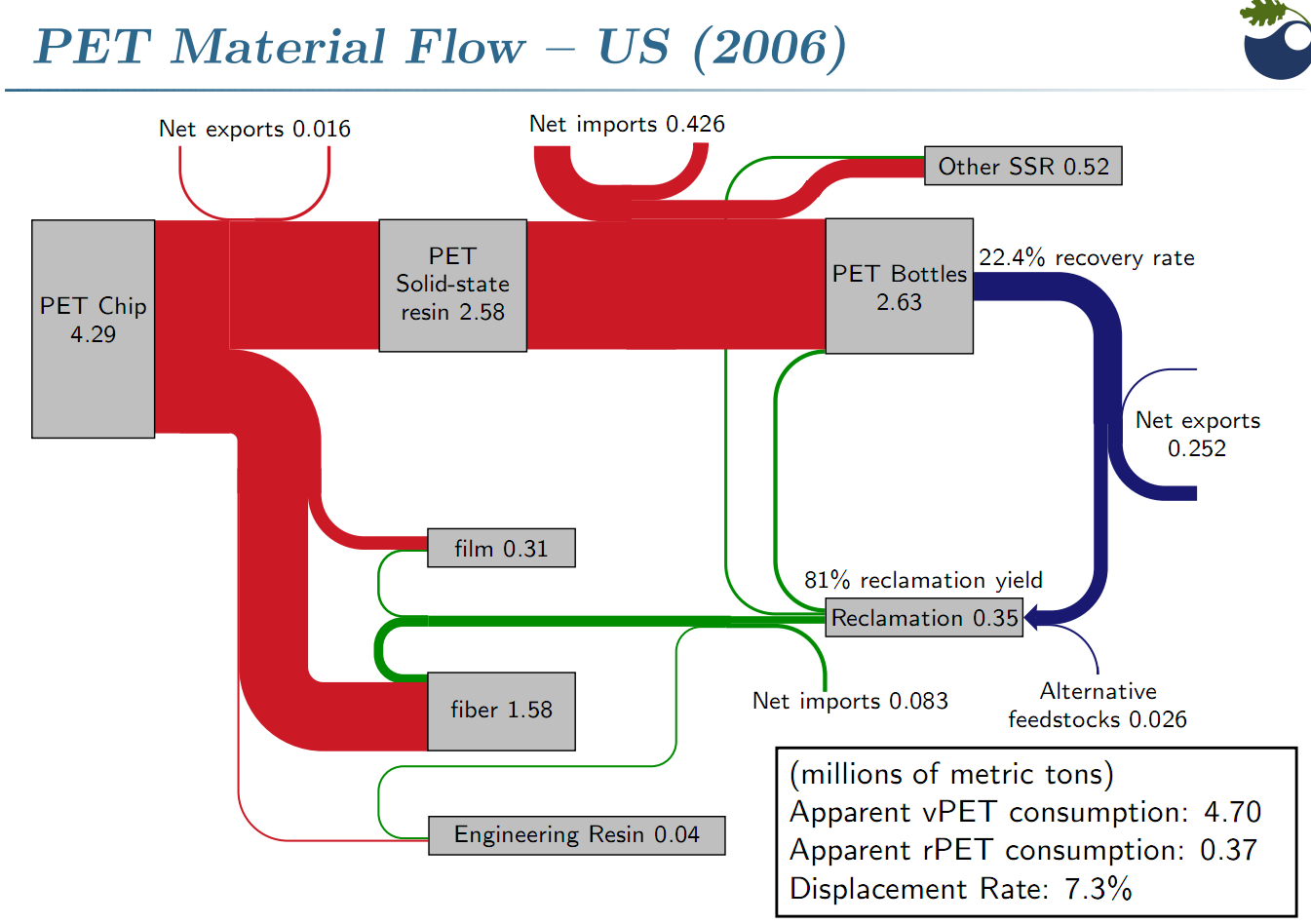
The Sankey diagram shows PET flows in million metric tons in the U.S. in 2006. 4.29 mio tons of pet flakes are being produced, of which 2.63 mio tons are transformed into PET bottles (other products are PET film and PET fiber). Only 22.4% of these bottles could be recovered after use. This “loss” is being represented by the blue flow which has only a fourth to a fifth of the width of the red entry flow. Recovered PET bottles are exported or reclaimed, closing the loop at least for a fraction of the PET flows.

Interesting Sankey diagram. Congratulations to Kuczenski/Geyer for visualizing this so clearly. Your comments appreciated

More Minard

Just back from a holiday, and in order not to keep you waiting for new Sankey diagams … shuffle, shuffle, draw … here are two more one from the Mondays with Minard series at the Cartographia blog (see previous post).

The first one shows French wine exports in 1864. A lot of the good stuff goes to European neighbours, the U.S., to Brasil, Uruguay and Argentina [the latter today an exporter of great wines themself]. But there are also some gourmants that appreciate ‘un verre de bon rouge’ in remote places such as India, China, and of course the outer French territories (Mauritius and Reunion). Not sure what the unit of flow is, as the image is to small to read.

The second one is a map of France that shows the transport of wine and spirits in 1857.

Most of the good stuff is shipped to Paris along rivers (green) and major railway lines (pink). Road transport seems to have been excluded. You can also see the transports to the ports for exports (yellow). Flows are in tonnes, but the band itself shows transports in both directions. This national map could be seen as an inset into the above map.

Sankey diagram for mountain refuge PV-diesel hybrid system

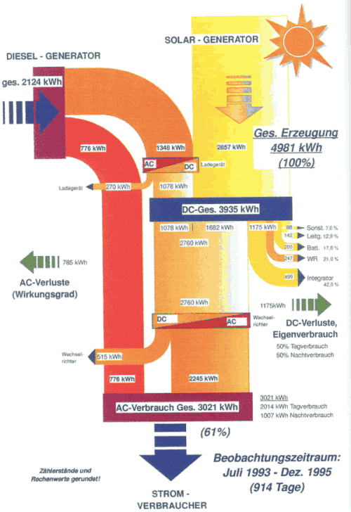
An interesting project summary can be found on the energyech.at pages, “a virtual exhibition and information platform” by the Federal Ministry of Traffic, Innovation and Technology (Department for Energy and Environmental Technologies) and the Austrian Energy Agency”. A PV-diesel hybrid energy generation system was installed at mountain refuge “Klagenfurter Hütte” in southern Austria to secure power supply and reduce dependency on diesel fuel, and to bring down energy costs.


The Sankey diagram shows the energy flows over a 30-month test period from July 1993 to December 1995. Out of the 4981 kWh of energy, 2124 kWh were produced by the diesel engine, while 2857 kWh came from the 18 sqm installed PV modules. A storage battery is installed, and the diesel generator can be used to recharge it if there is no sunshine. The overall efficiency of the system was 61% over the testing period, but could be higher after the energy measuring equipment (consuming 499 kWh itself) was removed after the testing period.

The Sankey diagram shows actually measured values in kWh. It has a top-to-bottom orientation. Diesel is on the left side, the photovoltaic system on the right. Losses branch out horizontally. The battery is the blue box labeled “DC-Ges.” in the middle.

Mes chers amis: ‘How not to Sankey’

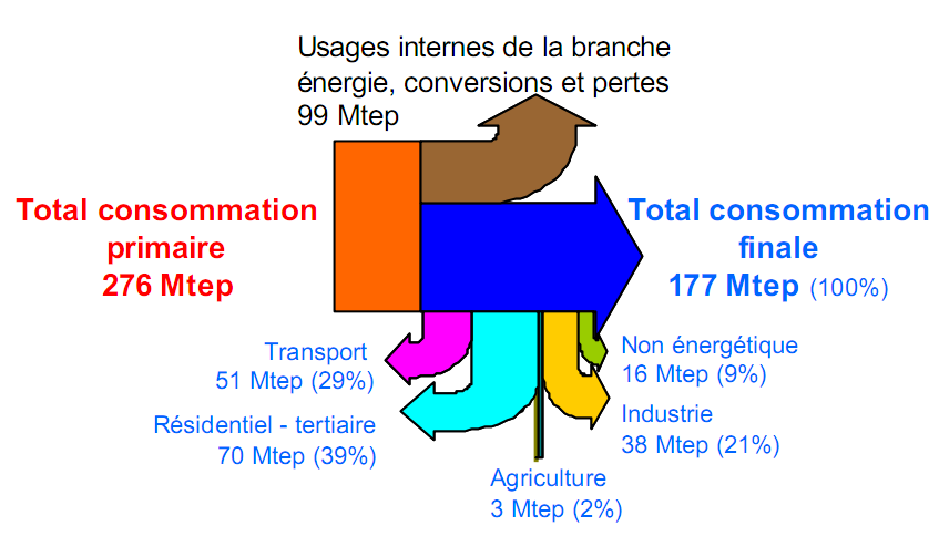
A presentation from 2005 on the French energy flows included the Sankey diagram below (I prefer not to name the author or the link to the original source, in order not to embarass anybody).


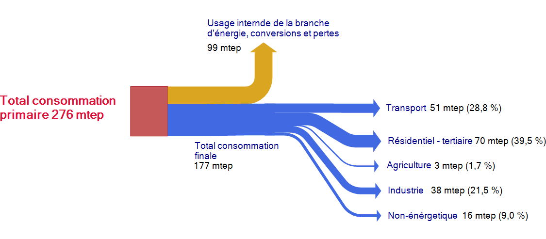
This Sankey diagram is pretty much messed up, and definitely a candidate for the “Worst Sankey Diagram Contest” that has already been called for. It took me a few seconds to understand that the flows dangling vertically below the blue arrow are actually a breakdown of the 177 mtep consommation finale. Vraiment … j’ai vu mieux que ça!

This is more or less how I would do it. Less colors, a breakdown of the blue flow into the five consumption sectors.

Material Flows for Nut Processing Plant

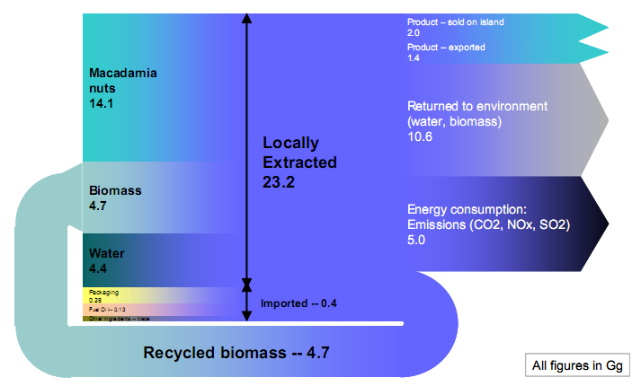
The report about the Material Flows on the Big Island of Hawai’Ii I blogged about a while ago has another Sankey diagram which is interesting and I thought I share this one too.

The diagram shows the input/output flows of material in the Mauna Loa macadamia nut processing plant. Annual production is 3.4 tons.

“From a materials standpoint the plant exhibits an impressive import/export ratio, relying on imports to the island for only a small portion of its total production requirements.”

All flows are in Gg (that’s 10E9 grams, or 1000 tons). Apparently a tiny problem with the recycled biomass loop flows, but otherwise a nice one. Small and trace flows not to scale for good.

The Beauty of Sankey Diagrams

End-of-year cleanup of my bookmarks and saved diagrams. There are more goodies, and enough in stock for a couple of posts next year…

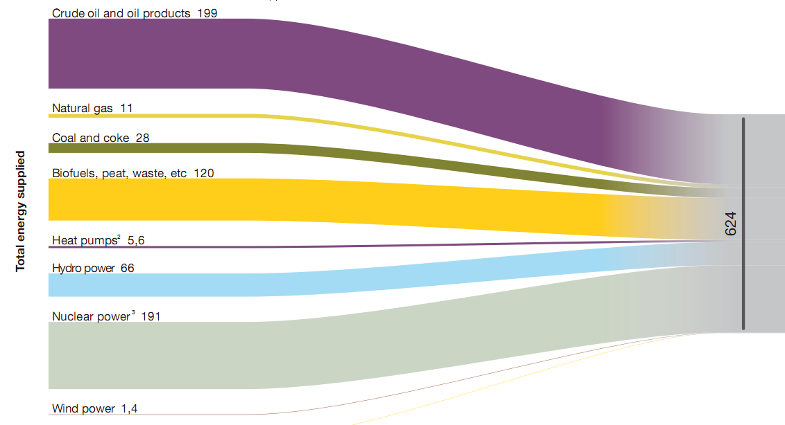
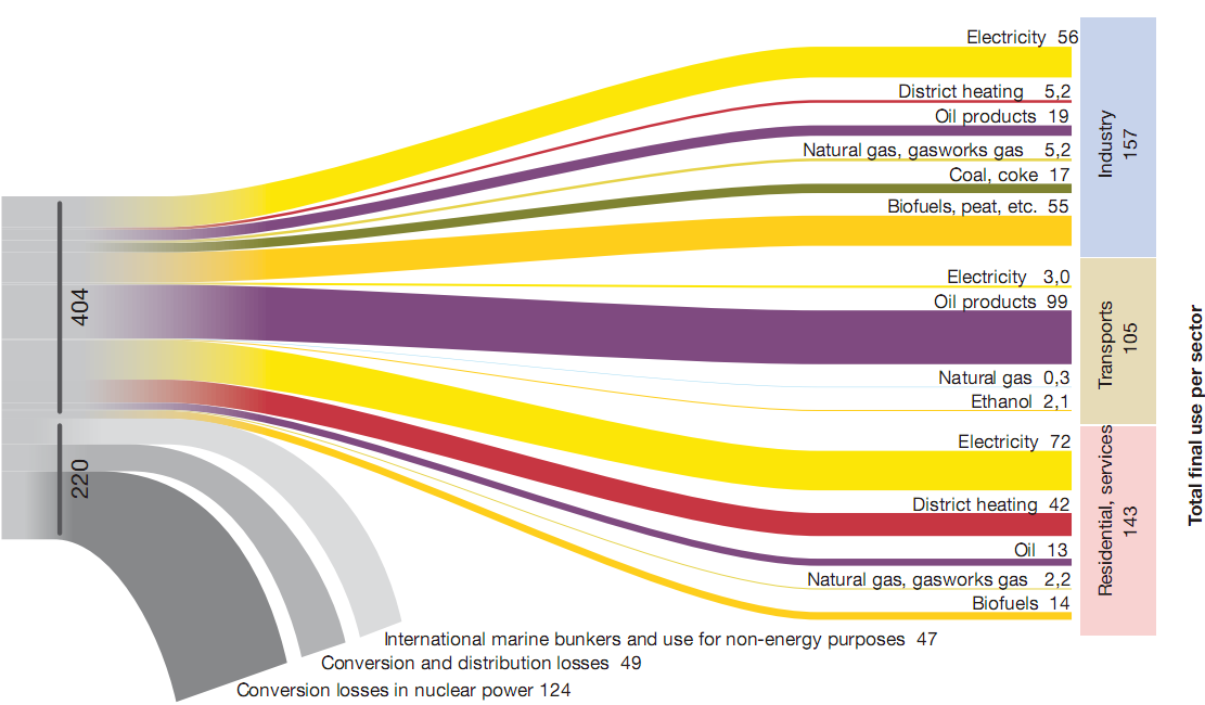
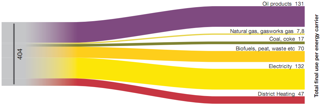
Below are three image sections of a Sankey diagram showing Swedish energy flows in 2007. These were published on p. 54/55 in the report ‘Energy in Sweden 2008’ by Swedish Energy Agency (Energimyndigheten). Numbers are in TWh, source for the diagram was Statistics Sweden data.

The first diagram (which is the left part of the diagram) shows the total 624 TWh energy supplied and the energy sources. The second one is the breakdown of energy produced by sectors, and also shows the losses in energy conversion. The third on is a different breakdown of the 404 TWh by energy carrier.

Nothing more to add. They are simple, clean, beautiful.