Updated Ireland Energy Sankey Diagrams

Colm from carbontracking.com in a comment to this blog post on Energy Flows in Ireland pointed me to an updated version of this Sankey diagram for 2007.

Sustainable Energy Ireland has published the report “Energy Ireland – Key Statistics 2008”.

This is the updated overall energy flow Sankey diagram from the report.

And here is another interesting one from the same report. It features the fuels used for transportation in Ireland with a breakdown by vehicle type.
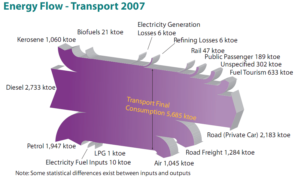
All flows are in ktoe (1000 tonnes of oil equivalent, 1 ktoe = 41868 GJ). The flows seem to be mostly to scale, although there must be a problem with the flow ‘Refining Losses 6 ktoe’ which seems wider than the ‘Rail 47 ktoe’ flow, for example. Private cars consume most energy of all vehicle types (2184 out of 5685 ktoe or 38.4 %) , followed by trucks (road freight) and airplanes.

I won’t be commenting on the 3D design of the Sankey diagrams, which is definitely … eye-catching. Colm asked which software has been used to create these, but another reader had already pointed out in a comment that it is based on SankeyHelper, but has undergone retouching in Illustrator.
More Merry-Go-Sankey Diagrams

After writing about VisioGuy’s radial Sankey diagram idea, I went through my bookmarks and collection of Sankey diagrams in search of further candidates for this special class of circular flow graphs.

Here are two goodies… 😉

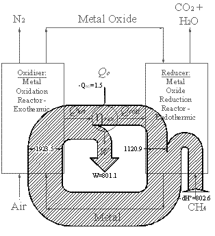
Below is a black/white Sankey diagram of energy fluxes in a chemical loop combustion cycle from an Imperial College website. It is similar to the radial one Chris designed, however it is not exactly circular. Not all of the entries and exits of the cycle are shown as Sankey arrows. The exit of the arrow labeled W is to the center (would one call this anticentrifugal?). The methane input makes a U-turn before entering the loop.

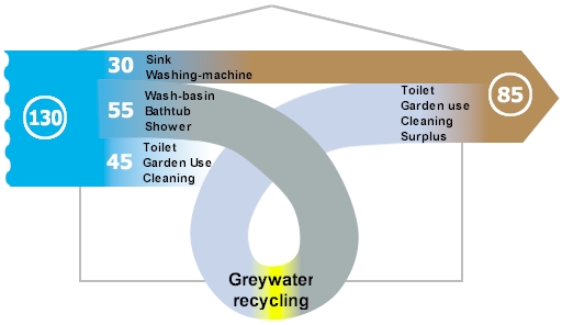
The other Sankey diagram is from this website of a U.K. based company, and shows greywater recycling. The average consumption of freshwater per person / per day in the UK was 130 litres in 1996.

The water from wash-basins, shower and bathtub could go through a recycling stage and be reused for flushing and watering the garden. The designer gave it a roller coaster style loop, which sure doesn’t add to the information content of the graphic, but immediately draws the reader’s attention to the recycling. I am not sure where the third flow coming from the right goes to. It represents the potential savings of 45 litres/day, but kind of disappears behind the loop.

I’ll post more of these as I come across them.

United States Annual Energy Review 2008

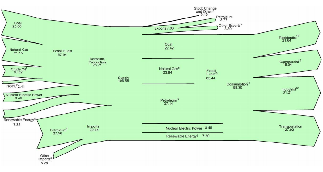
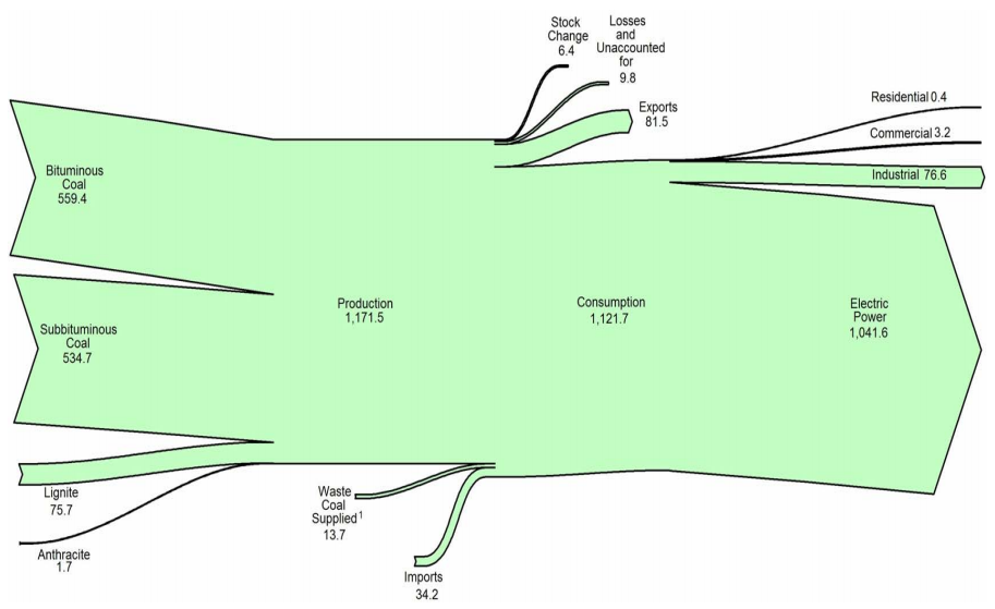
U.S. Energy Information Admmoinstration (EIA) now has the 2008 Annual Energy Review (AER) on their website. It contains Sankey diagrams for the nation’s overall energy flows (almost a “classic”) and four additional separate Sankey diagrams for petroleum, natural gas, coal and electricity.

This is the U.S. Energy Flow diagram for 2008:

Check the original PDF file with the accompanying footnotes for further details. Overall energy consumption in 2008 was 99 Quadrillion BTUs (preliminary value, slightly down from the 101 Quadrillion BTUs in 2007.

Among the other diagrams in the report, I chose to show the one for coal. 1121 mio. short tons have been consumed in the U.S. in 2008, mainly (1041 mio short tons) for electric power generation. The U.S. is a net coal exporter.

The diagram has a weird sinking downward feeling, caused by the fact that the main left-to-right orientation axis is not maintained. Looking at this it makes me want to shout out: “Hey coal Sankey, cheer up, life isn’t that black…!” 😉

The original full AER report (7.5 MB) can be found here.

Matlab routine for simple Sankey diagrams

Just came across a new piece of software for simple Sankey diagrams.
DrawSankey.m is a routine for Matlab that allows to produce diagrams like these:

DrawSankey.m is from the Industrial Energy Systems Laboratory (LENI) at Swiss EPFL in Lausanne. Find more information on their Wiki.

I haven’t tested it myself yet, but this definitely looks like an interesting add-on for Matlab users. I have added drawSankey.m to the Sankey software list.

VisioGuy invents Radial Sankey Diagrams

Chris the VisioGuy recently came up with Radial Sankey Diagrams. Although he didn’t seem to be sure if there is a “need for radially-oriented Sankey diagrams”, the commentators of his post immediately came up with ideas: use for rotating or radiating processes, cigarette rolling, recursive industrial processes, reinvestments, and so on… even stellar nuclear reactions were mentioned.

This is the ‘Everything Radial’ Circular Sankey Diagram

… and this is the ‘Tangential Fly-off’ Circular Sankey Diagram

One concern seems to be that the proportional arrow magnitude doesn’t work that well, since the human eye perceives the arrow area rather than thickness in such a circular Sankey diagram.

Thanks VisisoGuy for this contribution to the big basket of Sankey diagrams

Thermax shows benefit w/ Sankey diagram

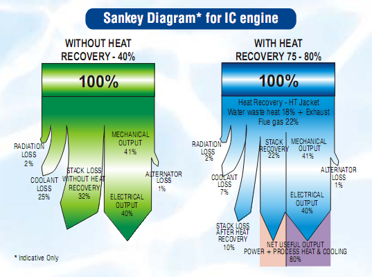
The PDF product brochure of Thermax Multi Energy Vapor Absorption Machines (Source: Thermax India Ltd, Pune) features a Sankey diagram comparing a conventional system (green) with a system that has heat recovery (blue).

The Sankey diagrams are labeled as “indicative only”. Fair enough, since the small flows (e.g. “radiator loss” and “alternator loss”) are not to scale. In fact this over-emphasis of the smaller flows seems to lead to an underrepresentation of the actual benefit of the Thermax system: The 80% “net useful output” of the blue diagram is only shown with a width of roughly 50% [measured with a conventional ruler off my screen…]

Any other product brochures with Sankey diagrams you are aware of? I actually found this pictured in a scientific paper (DOC).

It is also a rare example of a top-down orientation in a Sankey diagram. Most of the ones you find are left-to-right or bottom-to-top oriented.…

Diesel Engine Sankey Diagram

Just back from a few days at the beach, here is just a quick one…

User BoH created a Sankey diagram for a diesel engine and uplodad it to the WikiCommons. It is in Dutch and shows the energy efficiency of the fuel being burnt in the motor.
Sankey diagram for Diesel engine (WikiCommons)
49.3% of the energy is useful energy transformed into motion, while the rest is lost. The main losses (30.45%) occur at the exhaust gases, and with cooling water (approx 10.5%).

The smaller arrows are not to scale (see the 0.76% arrow branching off on the left side compared to the one representing 1.5% (smeeroliekoeling, cooling of lubricant oil)). Also, I am not sure whether the author forgot an arrow at the blue node labeled “Lucht” (air).

Anyway, apart from these flaws it is a neat diagram. I particularly like the color gradient from ‘red hot’ to ‘cool green’.

U.S. Oil Import Sankey Movie

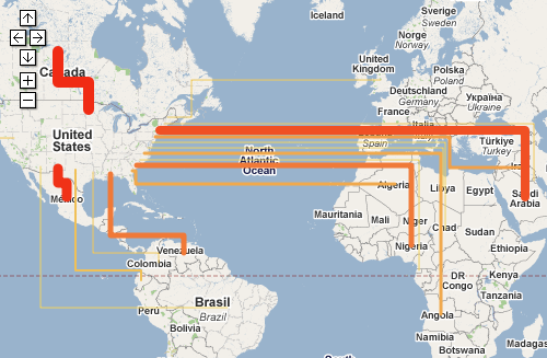
Renown Rocky Mountain Institute (RMI) founded in 1982 by Lovins and Lovins have an interactive oil imports map on their MOVE project webpage.

You can see the oil imports to the United States from January 1973 to August 2008 on a map that depicts the flow quantities as Sankey arrows linking the country of origin and the U.S. If you switch to the unit “Dollar”, you can see the value of the oil imported depicted as Sankey arrows.

One can play the the whole 35-year period as a movie, or use the slider on the time line to see individual months. The data used is from publicy accessible EIA/DOE statistics.

The United States is still 60 % dependent on imported oil. MRI’s MOVE project seeks possibilities to reduce foreign crude oil dependencies. The goal is to “get completely off oil by 2050, led by business for profit.”

Go to the RMI movie page and try it yourself. When I did the Lybia Oil Export map last year I wasn’t aware of this Sankey movie, which is of course much nicer.