New Zealand Energy Flows 2007

To compensate for the rather awkward Sankey diagram from NZ in my last post, here is a more colorful, and more recent one from Aotearoa. It shows the energy flows of New Zealand in 2007. The Ministry of Economy published a report “Energy in Brief”, which also contains this Sankey diagram:
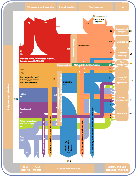
The diagram shows the main flows in gross PJ (1 petajoule = 1015 J) and is “to approximate scale”. Flows below 2.5 PJ are neglected.

Energy produced domestically from various sources comes from the left, imports of coal and oil enter in the leftmost column from the bottom and the top. The energy flows pass through transformation and conveyance phases, to be finally shown in the different use sectors. Losses in transformation and conveyance are visualized with downward arrows, while losses in the end use are not considered.

There are some design flaws, especially when you look at the arrow curves. Also the fact that flows are only “to approximate scale” is in my opinion not acceptable [an arrow representing a flow of 3 PJ has the same width as one for 6 PJ, and both are only half the width of the 30 PJ flow]. But the overall impression is much better than in the version 10 years before.

Click here for a larger version of the diagram (PDF).
Confusankey Diagram

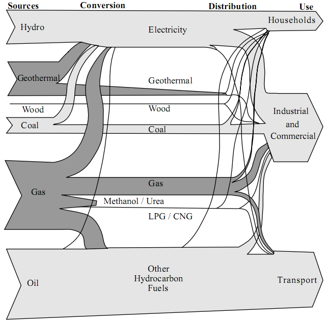
From the deepest and darkest parts of my bookmark list, here is a Sankey diagram for energy flows in New Zealand in 1997. I found it in a PDF document on this website of the Ministry of Economic Development (maori: Manatû Ôhanga).

The text under the diagram reads: “This energy flow diagram summarises New Zealand’s energy use. Primary energy sources are at the left. The flow of these through conversion processes to consumers is pictured, with final end-use classified by consumer type. The width of the bands is approximately to scale.”

Well, almost everything that can go wrong in information visualization goes wrong in this diagram… No quantities or units are given. Flows that are “approximately to scale” narrow down along the way. [The only explanation I have for this, is that this a novel way to account for transmission losses.] Streams meet, but don’t seem to merge. No idea what the spaghetti flows are good for…
In defense of the authors of this diagram I can say that in 1997 there probably weren’t any Sankey diagram software tools around.

I have a nicer one for NZ, which I will present in of my next blog posts. Better energy flow Sankey diagrams from other countries can be seen here, here or here.

Water Flows in Electro Plating

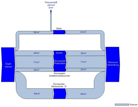
Austrian consulting company Stenum has revamped their Sankey Editor 2008 website a little bit, and they added new sample Sankey diagrams. The ones shown below are for the water flows of an electro-plating factory before and after optimization.

before:

after:

The diagram is in German, but I can understand as much as this: All flows are in cubic metres. Apart from the hydrogen peroxide flow entering from the top the flows shown all run from the source (water supply) to the sink (waste water treatment), the nodes in the middle (flushing, backflushing?) are the actual breakdown of the water flows. These nodes are adapted to the arrow width – a nice feature.

On top of that, blue seems the right choice for both water and H2O2 flows.

What goes up, must come down!

For most Sankey diagrams I find when browsing the web, a ‘left-to-right’ or ‘bottom-to-top’ orientation prevails. ‘Top-to-bottom’ is less common, but there are also examples like this one.

A rather untypical shape for a Sankey diagram has been up on the German page of the e!Sankey webpage.

It shows the energy balance for a pumped storage power plant as a curved shape, with the energy input at the left leg, and the energy that can be recovered (77.3%) at the right one.

Energy is stored “in the form of water, pumped from a lower elevation reservoir to a higher elevation. Low-cost off-peak electric power is used to run the pumps. During periods of high electrical demand, the stored water is released through turbines. Although the losses of the pumping process makes the plant a net consumer of energy overall, the system increases revenue by selling more electricity during periods of peak demand, when electricity prices are highest. Pumped storage is the largest-capacity form of grid energy storage now available.” (Wikipedia)

I searched for the original Sankey diagram in the source given (Quaschning 2007) and found this text with the diagram in chapter 6.1.2. That diagram already featured the curvy shape, and has just been reproduced similarly.

The use of the curve layout seems justified here. The author chose it to point out the difference in altitude. The upper basin is at the apex of the curve. Water pumped up from the lower basin requires energy, which can partly be recovered when the water runs down again.

What goes up…

World and US GHG diagrams from WRI

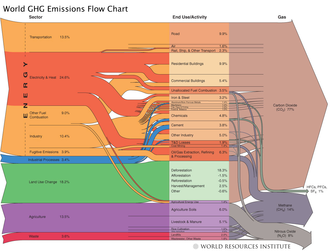
Last August I reported about a Sankey diagram showing World GHG emissions, published on the website of the World Ressource Institute (WRI). I couldn’t show the diagram due to copyright concerns in that post, but to my delight, Tim Herzog, co-author of the WRI publication and Director of Online Communciations at WRI in a comment to my post granted permission. Thanks, Tim!

So here it is:

The diagram shows the activity sectors from which of greenhouse gases (GHGs) originate. The largest portion is from energy generation (including transport), followed by land use change and agriculture. Direct emissions from other industrial processes (other than combustion processes) and waste is comparatively small. The arrows on the right side give a breakdown into the individual gases with carbon dioxide as the main greenhouse gas (77%) followed by methane and N2O.

All data is for 2000 and given in CO2 equivalents with the GWP 100a weighting factors for methane, nitrous oxides, HFCs and PFCs from the IPCC 1996 report. The total quantity is an estimate of 41755 MtCO2 equivalent. Land use change shows negative numbers too, because credits can be given for reforestation (newly planted trees absorbing CO2).

Here is the Sankey diagram from the same report just for the 2003 GHGs in the United States.

The overall CO2 equivalents are 6978 Mt in the US in that year, but the portion of GHGs from fuel combustion is higher. CO2 is 85% of the GHGs. For more details on the US GHG Sankey diagram, go to the WRI web page.

Kudos to the makers of these Sankey diagrams. Apart from the rich content they convey, they are also beautiful examples of how elegant Sankey diagrams can be.

Data Center Electrical Efficiency Sankey

The 2007/2008 White Paper #154 Rev 1 published by APC explains “Electrical Efficiency Measurements for Data Centers”. The author points out that DCIE (Data Center Infrastructure Efficiency), defined as ‘IT Load Power’ divided by ‘Total Data Center Input Power’ is a good metric to analyse data center efficiency.

In fact, as can be seen from the Sankey diagram shown in the paper, the majority of electrical energy consumed in a data center is for cooling, UPS and other supporting infrastructure equipment.

No typical DCIE is given, but the samples shown suggest that it ranges between 30 and 50 %. Several constraints have an impact on the actual DCIE, such as the IT load itself and the outside temperature, and thus should be reported along with the measurement.

A nice idea to present the breakdown on electricity consumption as a Sankey diagram, rather than as a (boring?) pie chart, especially when speaking of “power flows”.

Download the WP #154 from APC’s website.

Teaching kids energy efficiency

Mr. Palmer, a UK physics tutor, has many of his physics lectures for General Certificate of Secondary Education (GCSE) online, with notes and illustrations. You can find topics such as “motion”, “heat”, “nuclear radiation”, and even “the origins of the universe”. Very infomative, and well illustrated, even if you are not a high school student.

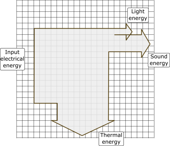
To attract student’s interest and make them understand efficiency in the “electricity” topic, he asks them to draw a Sankey diagram for their iPod.

The three Sankey diagram examples Mr. Palmer shows in his notes use the simple but effective grid paper approach that I have shown in this post.

I have tried to get to the numbers behind the diagram, but even in the tech specs, in the product environmental report for the iPod and on Apples environment website, they don’t give details on how much of the power is used for screen lighting and sound, and how much is lost as heat. So I guess that Mr. Palmer might have made these up, and that the energy efficiency of 31% for the iPod is just an arbitrary number…

Even though I didn’t find the hard facts, I came across some ideas and fancy gadgets for the iPod, that make its use “greener”, even though they do not increase the energy efficiency of the appliance itself:

And of course there are several hints, that help to really reduce energy consumption and make your iPod more energy efficient, such as dimming the display and avoiding to do a skip search on titles.