Where is the money, honey?

Nathan at FlowingData – Strength in Numbers presented a Sankey diagram by AP’s Nicolas Rapp and Damiko Morris (originally from this post on Nicolas’ blog). It shows where the $173 billion AIG received from government went to.
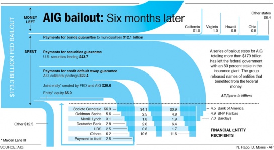
I especially like the inverse waterfall arrow endings and how they intersect with the grid of beneficiaries.

Nicolas, who works in Information Graphics for Associated Press, later presented another Sankey diagramm, displaying how the “nearly $12 trillion that was allocated in programs affecting the financial services industry” were used.

The author says “I spent the day researching and realizing this graphic” (@Nick: how much time was the research, how much the drawing?)

He adds “Fun stuff”, a comment which probably refers to the Sankey graphics part rather than to the content depicted… šŸ™

Energy Recovery from Process Air

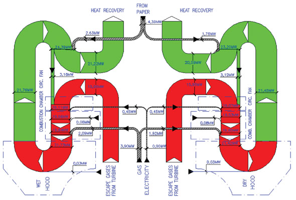
This article on “Energy Savings in Tissue Production Process: The Case of the Hayat Tissue Mill in Turkey” by A. Isiklar, L. Aydin, D. Mainardi and O. Lopez was published in July 2008 in the TAPPSA Journal (Technical Association of the Pulp and Paper Industry of the Southern Africa). The article describes how energy can be recovered from process air in a tissue plant in Turkey using a cogeneration hood. It features three beautiful Sankey diagrams, one of which is presented here.

“The exhaust gases coming from the hood are used for the production of the steam needed to feed the YD and the other auxiliary equipment of the mill (wet strength pulper, hall ventilation). The residual energy in exhaust gases in excess from the boiler are used in order to feed a chiller unit, which in turn runs the air conditioning system of the electrical room”.

This almost symmetric top to bottom oriented diagram shows the energy in MW for a certain production capacity (details not given in the article). It is a section of the other Sankey diagram featured in the article (Fig. 3) showing the whole process including the gas turbines plant, the cogeneration hood and the waste heat boilers (omitting only the absorption chillers). Only the latter shows the reduced heat loss (see light blue arrows labeled “to atmosphere”).

As for me, that’s the kind of curves I love… šŸ˜‰

Swiss Wood Flows

I received another diagram from Gabor Doka, who already pointed out the Swiss biomass flows Sankey diagrams to me. Gabor seems to have a close eye on publications in the environmental field in Switzerland, and he apparently is an avid follower of this blog. I appreciate.

He writes:

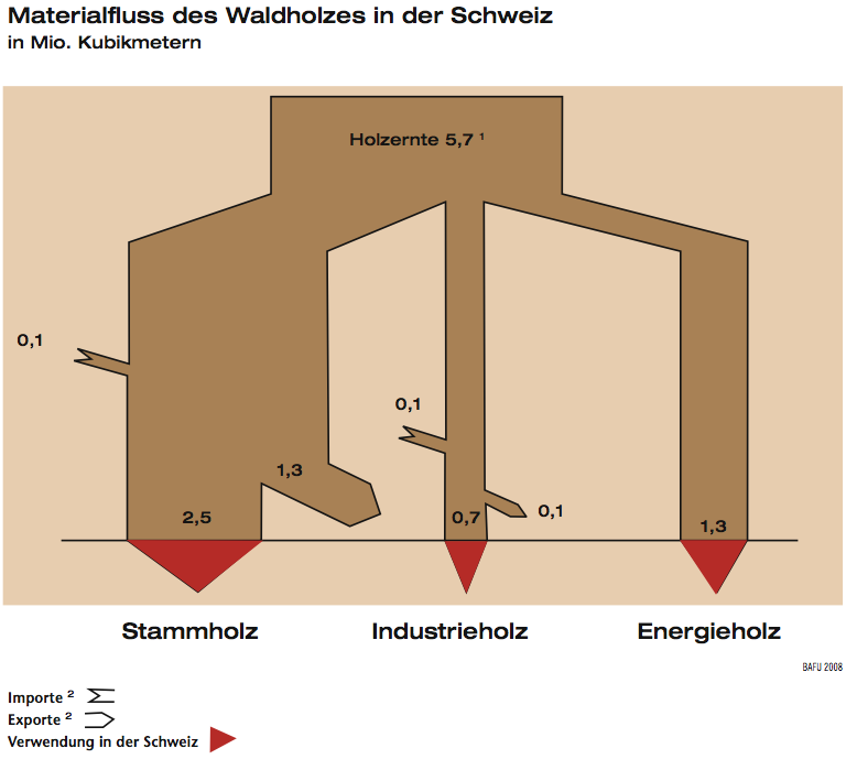
Now a very similar topic (just wood flows in Switzerland) but probably a by-the-book example of how not to do Sankey diagrams. This is from the FOEN magazine “Umwelt” issue 4/2008 (full PDF 8 MB here)

Shown are wood flows in Switzerland in million cubic metre. Again only in German though.

Errors that I saw include:
a) flows are slimming, when pointing in a non-vertical direction (“angle-dependent violation of mass conservation”). See e.g. “Stammholz Export” and “Energieholz” which both should be 1.3, but the latter is larger.
b) Addition of imports does not lead to wider flows. The author could not be bothered to deal with small flows, although 0.1 represents a 14 % increase over 0.7, i.e. perceptible.
c) The arrows representing “0.1” are over 2 times too wide, i.e. they visually represent 0.23. Also the arrow representing 0.7 is somewhat larger.

He continues:

What I do like is visual aid of identifying inland consumption (red arrows). Also inputs and outputs add up, which is always a nice thing šŸ˜‰ However, this seems like a stitched together diagram drawn manually (and probably re-drawn for publication). This is supported by the angled design and observation that in the original paper publication, the main input representing 5.7 Mio m2 is exactly 5.7 cm wide…

Not much more to add from my side. Thanks, Gabor, for this contribution.

From Russia with Sankey…

Using e!Sankey myself, I am also a subscriber to the e!Sankey board, so that I get a toast message every time someone posts over there…

Recently they had a post with a sample Sankey diagram in Russian.

A short interpretation is difficult for me this time, as I don’t understand Russian. I can detect a copper, zinc and lead flow labeled with element names (Cu, Zn, Pb) and iron. One color is used for all flows. The quantities are in tons.

Anyone can explain more of this Sankey diagram?

Efficiency Diagram for Ship Engines

MAN Diesel, a renown producer of marine and power plant diesel engines, has been working on improving fuel efficiency of its engines. Today, the fuel energy efficiency is about 50%. The MAN Turbo Efficiency System (TES) allows to recover of heat from the exhaust gas, which is responsible for about 50% of the energy losses.

Here is a Sankey diagram that shows the recovery of energy from exhaust gas.


Download a description of the TES here (PDF, 291 KB)
or view a high resolution version of the above Sankey diagram from their press picture gallery.

Combined Heat Power (CHP) Sankey

Have been very busy recently and have neglected the blog. Here’s just a quick one (to get some color on the top post again … šŸ˜‰ )

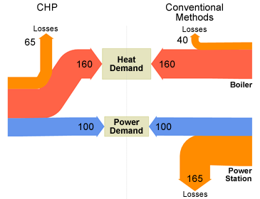
UK’s Department for Environment, Food and Rural Affairs (DEFRA) has crowned its new website on combined heat and power generation with a nice Sankey diagram.

What is CHP? “CHP systems are highly efficient, making use of the heat which would otherwise be wasted when generating electrical or mechanical power (…) and typically has an efficiency of over 80%”, the accompanying text explains.

The diagram is built similarly to this one presented in a previous post: The Sankey diagram doesn’t feature absolute figures, but flows are scaled in relation to the baseline of 100 units energy generation in a power plant and a CHP unit. In a cogeneration unit 160 units of energy would be produced at the same time. Losses are accounted for with 65 units in the CHP. To produce the equivalent energy quanities in a conventional power unit would cause losses 1.65 times higher than the energy output itself. In the boiler 25 % of the energy is lost (40 units).
Overall losses in convential generastion are 205 units compared to 65 units in a CHP.

Sam Brenner’s Sankey Diagram Generator

Sam Brenner, interactive design and development student at the Rochester Institute of Technology, has finished version 0.2 of his ‘Sankey Generator’ tool.

Inspired by state federal budgets Sam pursues to display financial figures in a clear and comprehensible way. Sources of state income are on the left, spendings on the right. As Sam says himself, this is still work in progress. “I’m trying to make a dynamic Sankey Diagram generator (…) What I would like to end up with is a program that can take numeric data like a budget and turn it into a diagram…”.

See that small step at the bottom of the middle part? Hey, here you have the “deficit”…

Interesting new tool. Not sure if the Sankey Generator tool will reach a status that would allow Sam to release it publicly, but have added it to my Sankey software list anyway. Hope version 0.3 has some fancier colors, though šŸ˜‰

Waste Composition Sankey Diagram

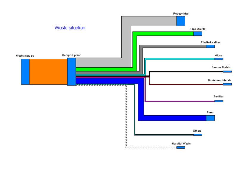
After the rather complex Sankey diagrams presented in my previous post, here’s another comparatively simple one. It is presented on the website of consulting and planning company UMTAS in Germany, to support their services offers in the field of material and energy flow management.

The diagram is just symbolic and doesn’t indicate any absolute quantities or a time period. It merely shows the compsition of waste.


The process labeled “compost plant” seems to be a kind of sorting station, where non-compostable items such as metals are being removed. Hospital waste appears to be absent and the arrow line is shown dotted. The input and output flows of the compost plant don’t seem to match – or is this just a trompe d’oeil?

In fact, the information conveyed in this Sankey diagram is no different from a typical pie chart. [This reminds me of a categorization of Sankey diagrams I had on my to do list]. Still, I think it is a valid representation of the data, and the diagram will get even more interesting, if one starts to study where the waste flow outputs are going to and how they are treated.