Tag: energy

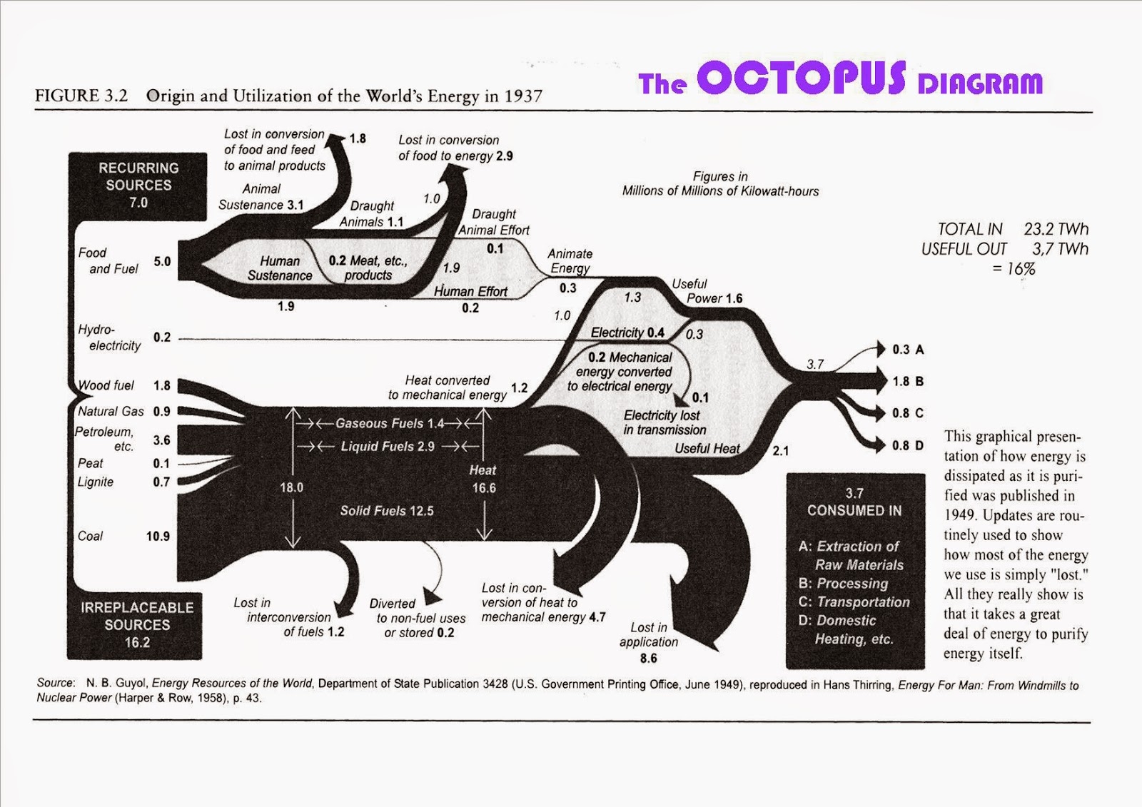
World Energy Flows in 1937

The below Sankey diagram from 1949 depicting world’s energy flows in 1937 is shown in this blog post by Michael Hohmann | LMH Design.


Flows are in TWh.
Michael says: “When I first saw this, I was reminded of seeing an octopus and called it an Octopus Diagram, with the octopus’ head at the input end at left, and the tentacles on the right, in between digesting and distributing everything that the various mouths at the head can gobble up”, asking himself “[w]here does all this Input energy disappear to with so little Output energy ending up as useful for us humans?”.

Energy Sankey Diagram Menorca

The Spanish island of Minorca (Spanish: Menorca) is part of the Balearic islands archipelago in the Mediterranean Sea. Less crowded than Mallorca, and more tranquil than party location Ibiza, this island is popular for family holidays.

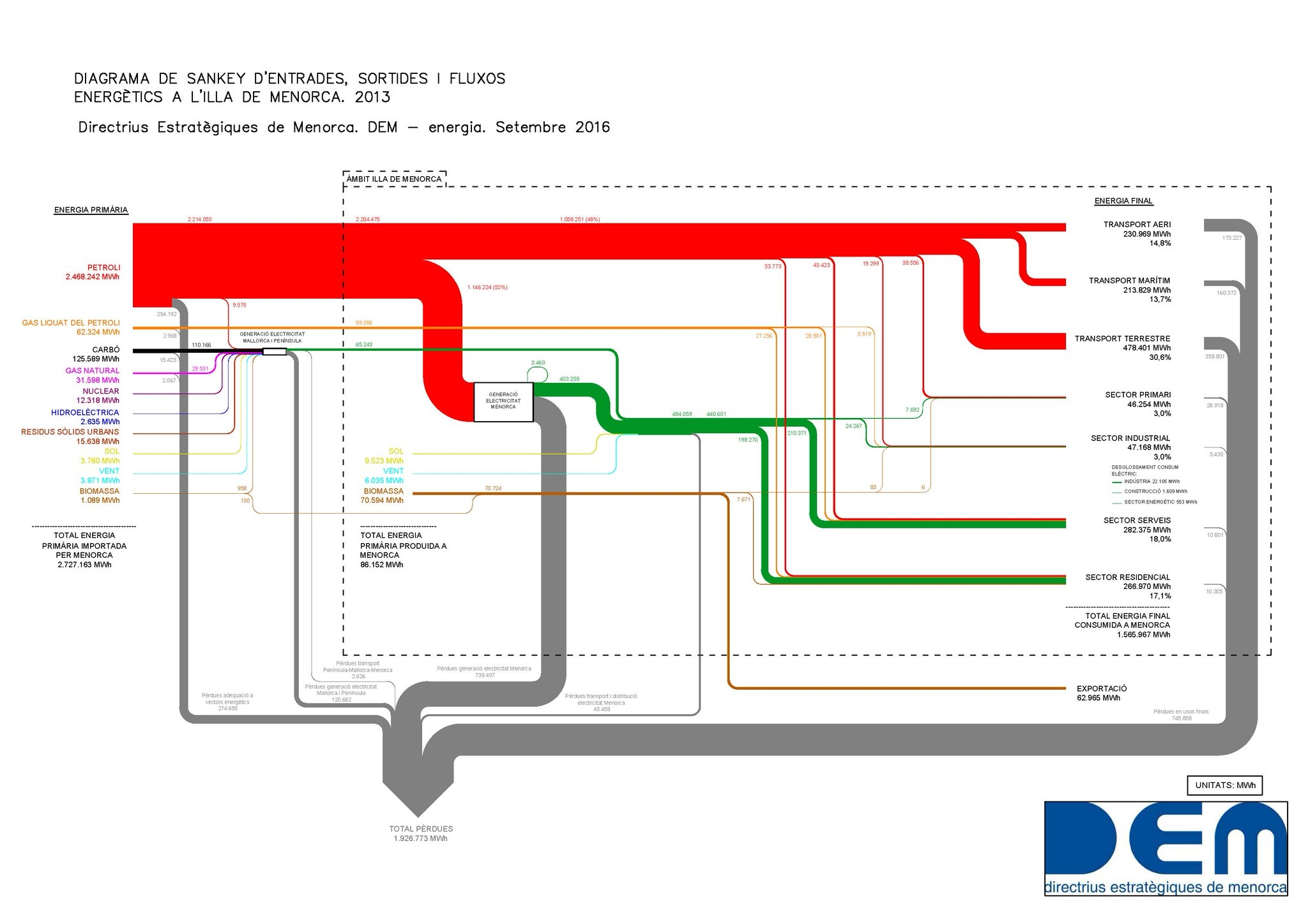
The Strategic Directorate of Menorca (Directrius Estratègiques de Menorca, DEM) has recently published this Sankey diagram depicting the energy flows of the island in 2013.


(via DEM Twitter)

Flows are in MWh. Primary energy input was 2.72 mio MWh in 2013, of which 1.56 mio MWh were used, while 1.92 mio MWh were losses. (difference was exported). Labels are in Catalan.

The energy visual is different from others that I have shown on this blog before: The island is almost entirely depending on petroleum as energy source. Maritime and air transport consumes a large part, as does the services sector (hotels). Industry sector is a rather small consumer.

You can find a report in Spanish with a similar Sankey diagram here.
Recovering Energy of Train Braking

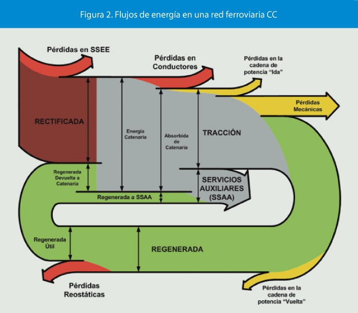
The article ‘Aprovechamiento de la energía procedente del frenado regenerativo en ferrocarriles metropolitanos’ by Álvaro López López published in the Spanish journal ‘Anales de Mecánica y Electricidad (May/June 2013)’, pp 12-18 has the following Sankey diagram.

No absolute numbers are given here. Still, we understand that from the motion energy during braking of the train a part (green flow) can be recovered and is being used for secondary systems (‘SSAA’) as well as being fed back into the overhead wire (‘cantenaria’).

Not sure though whether this Sankey diagram is a representation of the energy recovery during braking action only, or of the energy flows on a typical train ride.

Switzerland Energy Flows 2015

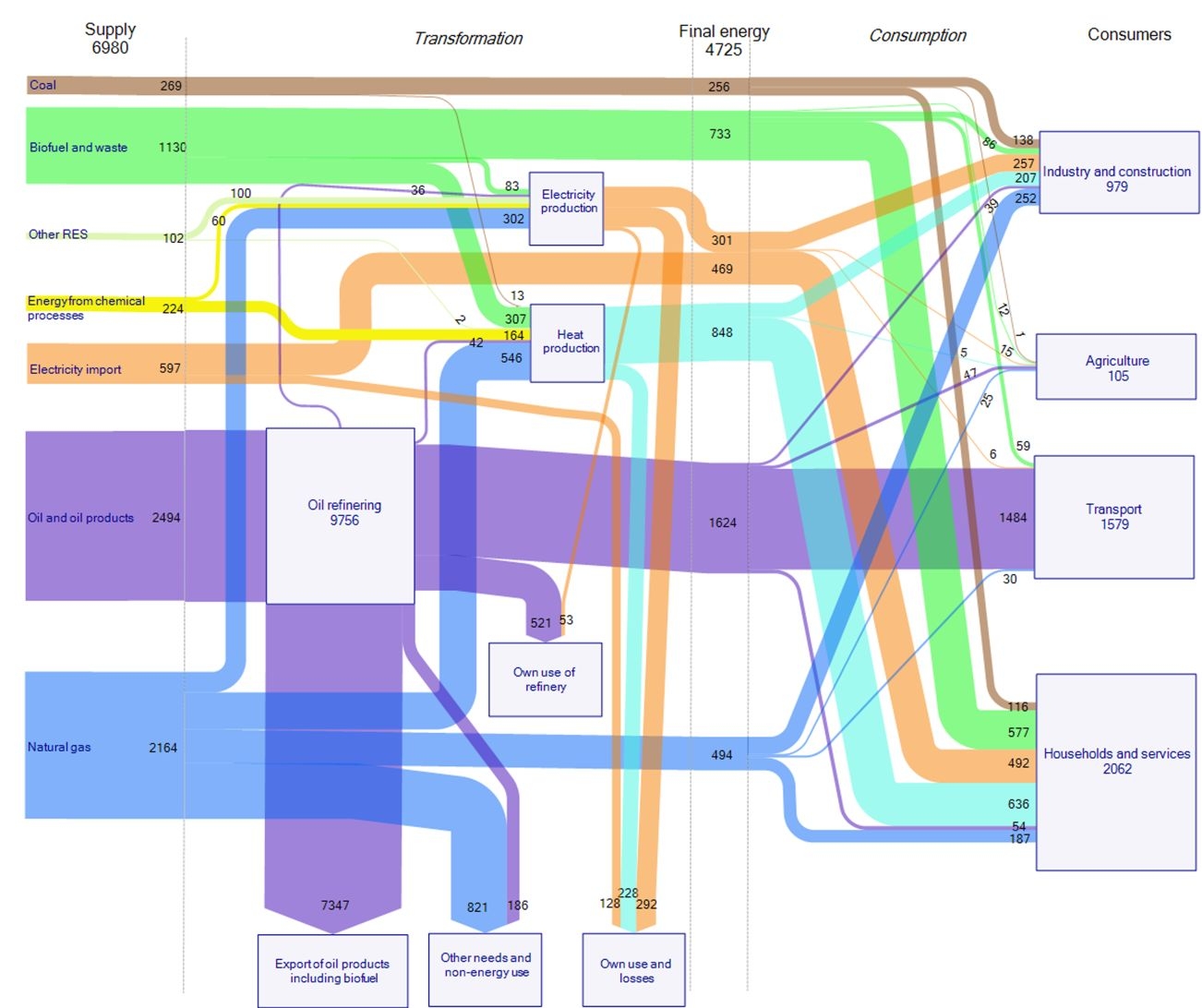
This Sankey diagram for energy flows in Switzerland 2015 is by Max Blatter of energie-atlas.ch.

Flows are in TJ. The diagram has a consistent color coding: electricity in light blue, oil and derivates in orange, natural gas and biogas in yellow.

Sectors where energy is used are shown at the bottom right with private housholds, industry, services, traffic and agriculture.

Interesting to see that Switzerland’s electricity exports and imports were about equal size in 2015 (blue arrows to/from the top).

A 2007 energy flow Sankey diagram for Switzerland was presented in this post.

RenewIT Project: Green Data Centres

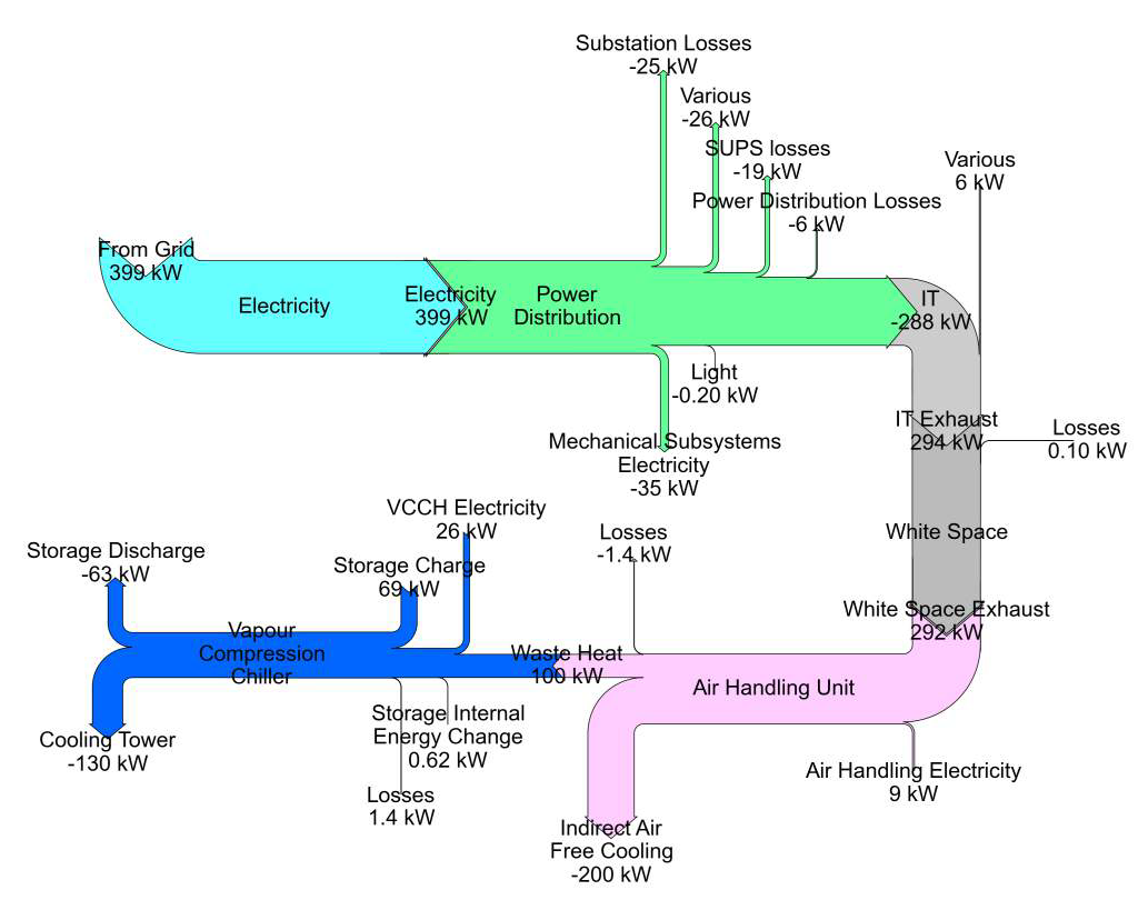
The European R&D project RenewIT studied energy concepts for renewable energy supply of data centres. The project partners from Spain, Italy, UK, Germany and The Netherlands looked at 18 different energy models.

In the final project report each of the concepts are described, accompanied by a Sankey diagram.

The above is figure 3.53 from p. 177 of the report showing the “Sankey chart for the distribution of average energy flows per year within different subsystems of concept 7 for scenario 3”.

Many more equally beautifully crafted Sankey diagrams can be found in the report, check chapter 3.5 Simulation Results of the publication Deliverable D4.5 Catalogue of advanced technical concepts for Net Zero Energy Data Centres. Authors: Nirendra Lal Shrestha, Noah Pflugradt, Thorsten Urbaneck (TUC); Angel Carrera (Aiguasol); Eduard Oró, Albert Garcia (IREC); Hans Trapman, Gilbert de Nijis, Joris van Dorp (DEERNS); Mario Macías (BSC) (get it here)