Tag: energy

Zero Emission Coal System Sankey Diagram

From a July 2013 article titled ‘Energy and exergy analyses of a Zero emission coal system’ by Linbao Yan, Boshu He, Xiaohui Pei, and Chaojun Wang of Beijing Jiaotong University, available at Researchgate. This Sankey diagram is for “the exergy flow of the improved Z[ero] E[mission] C[oal] system at benchmark condition”.

Note: Image not available anymore

All flows are in kJ. The individual process steps if the system are only labeled with acronyms. They are explained in the article: GF is gasifier, CL is cleaner, RF is a reformer, and CH is a CO2 heater. The article also features the energy flow Sankey diagram.

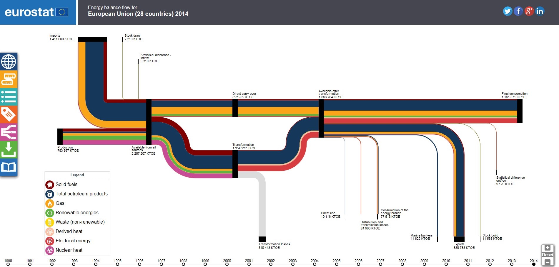
EUROSTAT Sankey Tool for EU-28

Interested in the energy flows of the Euopean countrues (EU-28)? Check out the Sankey diagram tool on the EUROSTAT webpage (the European Statistics Office).

You can choose to view the energy flows for individual countries, or the total for all EU-28. Switching between the data for the years 1990 up to 2014 lets you compare the changes over the last 25 years. The sidebar offers display options for the Sankey diagram.

Nice visualisation and much more fun to work with than statistics data in tables.

Energy Flows in Sweden by Counties

Sweden is administratively organized in 21 counties, called “Sveriges län”.

A new report ‘Energistatistik för Sveriges län och kommuner för år 2013’ (Energy Statistics for Swedish Counties and Municipalities on the year 2013), published by Länsstyrelsernas Energi- och Klimatsamordning (LEKS) features energy flow Sankey diagrams for all counties.

Here is an example for Skåne from page 17:

All flows in GWh per year. Percentage breakdown for contribution of fuels (left side) and for consumption (right side).

Actually the energy picture looks quite differently in some counties: For example, Södermanlands län (on page 19) has 33% coal/coke (‘Kol/Koks’). Kronobergs län’s most important energy source with a share of 29% is biomass (‘Biobränsle’).

Twenty-one wonderful Sankey diagrams … a sheer joy for a Sankey fan like me.

China Energy Flows 1971 and 2010

The article ‘Understanding China’s past and future energy demand: An exergy efficiency and decomposition analysis’ by Paul E. Brockway, Julia K. Steinberger, John R. Barrett, and Timothy J. Foxon (all of Sustainability Research Institute, School of Earth and Environment, University of Leeds, UK) appeared in Applied Energy 155:892-903 in October 2015 and features a comparison of China’s energy use in 1971 and 2010. These Sankey diagrams were drawn up to show “the overall flow of exergy to end useful work, and the exergy losses that occur during the various conversion processes”.

China’s energy usage is roughly tenfold in 2010 compared to 40 years ago (37 Mtoe up to 355 Mtoe). Not sure whether both diagrams are setup on the same scale but judging from e.g. the black coal flow (140 Mtoe in 1971, 577 Mtoe in 2010) that is about 4 times wider, I would say they are.

Another interesting detail in these diagrams is that the authors have included food and feed as energy source. This is the first time I see this in a national energy flow map. Given that the energy content of this “fuel” is higher than both combustible renewables and renewables together, it seems justified to include it. The efficiency of turning food and feed energy into muscle work, however, is very low (approx. 3%).

I invite you to read the full article (open access) and to comment on the Sankey diagrams shown in Appendix B.

University of Maryland, CHHP system

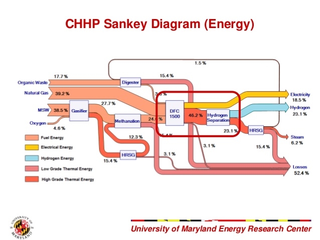
This Sankey diagram is from a presentation by a student team of University of Maryland. They participated in a Hydrogen Student Design Contest in 2011/2012 sponsored by the Department of Energy

The Sankey diagram is for a combined heat, hydrogen, and power (CHHP) system for the UoMD campus.

Flows don’t depict absolute values, but rather how the fuel input (municipal solid waste, organic waste, natural gas) is split into energy outputs (electricity, hydrogen, and steam). Losses (52.4%) at each process stage are shown as red arrows.

Lying with Sankey diagrams (5)

Haven’t posted much in this mini-series recently … not that there would be a lack of Sankey diagrams that have technical defects or simply misrepresent flow quantities with deliberate arrow widths.

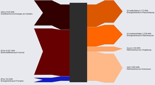
In this Sankey diagram from a website by AEPC the blue arrow is grossly exaggerated and not to scale with the other flows.

Flows are in KWh. Energy inputs (solar, fuel for boiler and pumps) on the left. Uses and losses to the right.

Sweden’s Energy Balance

Julien Morel of the Swedish Energy Agency (‘Energymyndigheten’) has pointed me to the newly released Swedish Energy Balance for 2014.

The publication (available here) has the English version of the diagram on page 4:


This one is interesting, as it is set up mirrored, to be read from right to left, in contrast to the common way of presenting national energy flows (e.g. here for Australia or here for Iran).

Overall consumption was 368 TWh in 2014. Sweden relies roughly one third on nuclear energy, one third on fossil fuels, and one third on renewables (wind, hydro and biofuels).

The different areas of the energy system are further detailed per consuming sector and per fuel type and shown with individual Sankey diagrams. So if you understand some Swedish, go check out the 17-page presentation.

Building Energy, Simple Sankey Diagrams

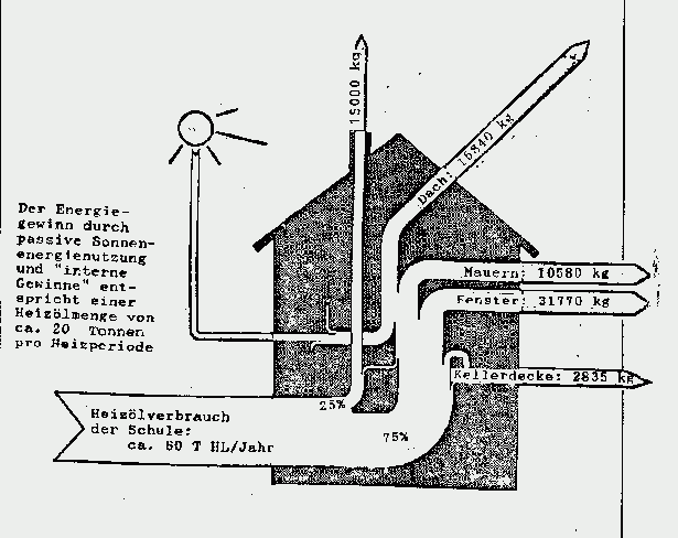
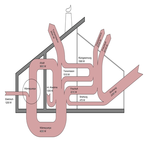
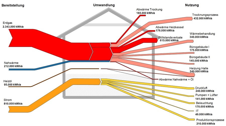
From my collection of Sankey diagrams here are three very similar samples depicting energy flows in a building. All three are from Germany (did I mention that more than half of the Sankey diagrams seem to be from Germany or Austria?).

These are all very simple Sankey diagrams. This first one is a hand-drawn goodie from the times when reports were still done with a typewriter. It shows use of fuel oil (‘Heizol’) in a school building, and interesting to see, the flows are given in kilograms fuel oil rather than to represent the heating value. The school building consumes 80 tonnes of fuel oil per year.

Note that flows are not to scale (arrow for equivalent of 10580 kg fuel oil annual heat loss through walls is about the same width as the one representing 31770 kg heat loss through windows). So this Sankey diagram doesn’t deserve an A…


The next building energy flow Sankey diagram shows flows in Watts (W). Not sure where I found this one. Flows again are not proportional (spot the 470 W flow and compare it to the others). Main inputs are radiation (‘Strahlung’) and electric energy. A heat pump cycling energy can be seen, so it seems that this one is maybe for a passive house.

This last one done with a Sankey diagram software hence flows are to scale in this one (although I have some doubts regarding the width of the fuel oil input arrow on the left). Flows are in kWh per year. Main fuel type is natural gas (red), some district heating (blue). Electric energy in yellow, consumed by IT, lighting, air compressors, and so on. This energy flow Sankey diagram is probably for a factory building or complex.

I will try to add the sources where I found these three diagrams. Please forgive my negligence this time.