Tag: heat

Thermax shows benefit w/ Sankey diagram

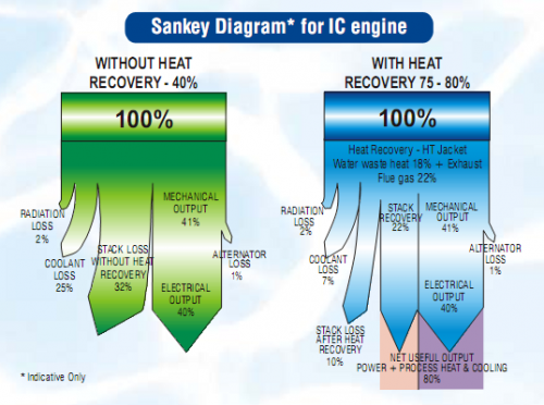
The PDF product brochure of Thermax Multi Energy Vapor Absorption Machines (Source: Thermax India Ltd, Pune) features a Sankey diagram comparing a conventional system (green) with a system that has heat recovery (blue).

The Sankey diagrams are labeled as “indicative only”. Fair enough, since the small flows (e.g. “radiator loss” and “alternator loss”) are not to scale. In fact this over-emphasis of the smaller flows seems to lead to an underrepresentation of the actual benefit of the Thermax system: The 80% “net useful output” of the blue diagram is only shown with a width of roughly 50% [measured with a conventional ruler off my screen…]

Any other product brochures with Sankey diagrams you are aware of? I actually found this pictured in a scientific paper (DOC).

It is also a rare example of a top-down orientation in a Sankey diagram. Most of the ones you find are left-to-right or bottom-to-top oriented.…
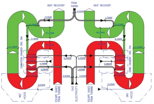
Energy Recovery from Process Air

This article on “Energy Savings in Tissue Production Process: The Case of the Hayat Tissue Mill in Turkey” by A. Isiklar, L. Aydin, D. Mainardi and O. Lopez was published in July 2008 in the TAPPSA Journal (Technical Association of the Pulp and Paper Industry of the Southern Africa). The article describes how energy can be recovered from process air in a tissue plant in Turkey using a cogeneration hood. It features three beautiful Sankey diagrams, one of which is presented here.

“The exhaust gases coming from the hood are used for the production of the steam needed to feed the YD and the other auxiliary equipment of the mill (wet strength pulper, hall ventilation). The residual energy in exhaust gases in excess from the boiler are used in order to feed a chiller unit, which in turn runs the air conditioning system of the electrical room”.

This almost symmetric top to bottom oriented diagram shows the energy in MW for a certain production capacity (details not given in the article). It is a section of the other Sankey diagram featured in the article (Fig. 3) showing the whole process including the gas turbines plant, the cogeneration hood and the waste heat boilers (omitting only the absorption chillers). Only the latter shows the reduced heat loss (see light blue arrows labeled “to atmosphere”).

As for me, that’s the kind of curves I love… 😉

A nice one from Poland

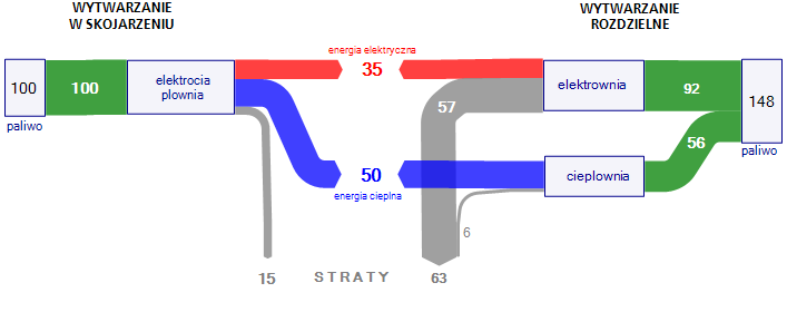
On my quest for more interesting Sankey diagrams I stumbled across a wykres Sankeya on a web page from Poland, which I reproduced here using ifu’s e!Sankey tool.

It shows the advantage of energy cogeneration plants over energy production in separate plants. From a base value of 100 a yield of 85% can be reached in cogeneration plants (35% electric energy, 50% heat energy – the original text accompanying the diagram says 30% electric energy, 55% heat energy) with 15% losses. To get the same energy amount from separate energy generation plants, the required energy feedstock is 1.48 times higher, with losses more than four times higher (63:15), especially originating from the generation of electricity.

While I am far from fostering one or the other technology with this post, I think this Sankey diagram merits special attention, because it is actually a 2-in-1 diagram (both with flow direction left-to-middle and right-to middle) and a baseline scenario comparison. A very nice idea!

Energy Balance for Stoves in Indian Silk Industry

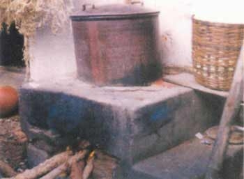
This article on the FAO website shows a comparison of several types of simples stoves and their energy balance using Sankey diagrams.

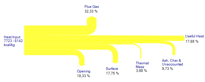
The Sankey diagrams show how the energy (typically from wood firing) is lost, and that only a small fraction of 12 to 20 % is actually being used as “useful heat”.

More of these “heat flow diagrams” can be found in chapter 4.2. of the article.

A rather special feature of the diagrams shown in this article is that the percentile values given for the flows cover a range (e.g. Ash and Char 5,97% – 12,15%), rather than a specific absolute value. This is rather untypical. Also, it can be noted, that the width of the arrows are not always to scale: compare, for example, the width of the “Surface” arrrow to that of the “Thermal Mass” arrow. It should be roughly four times wider.

The same Sankey diagram created with a Sankey software tool shows the arrow widths correctly.