Tag: U.S.

West Virginia Energy Flow Sankey

The Mountain State saw the annual Governor’s Energy Summit in Roanoke on Dec 9, 2009. West Virginia relies heavily on coal, and is a net energy exporter to other U.S. states.

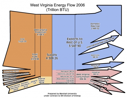
The energy flow Sankey diagram below (created by Marshall University for WV Energy Division) was presented at last year’s energy summit, and is available along with the other presentations here.

Figures are for 2006 in trillion BTU. Energy carriers used in WV are displayed as flows entering from the left. Domestic energy sources are in orange, while imported supplies are in sand color. Overall energy in 2006 was 4,384 trillion BTU. The state exported 81% of the energy (blue) and consumed 19% within (836 trillion BTU). A breakdown of doemstic consumption by sectors is shown in pink.

This Sankey diagram looks nice, but violates the basic rule for Sankey diagrams: flows have to be to scale among each other. The magnitude of the stacked orange arrows (representing 4100 trillion BTU West Virginia production) should be 14.5 times larger than that of the sand color flow (representing 283.86 trillion BTU), however it is only about 9 times larger, overemphasizing external supply (or underrepresenting domestic energy supply).

Or, compare the two arrows fro “crude oil” (10.14) and “natural gas” (230.12). The latter should have 23 times the width of the other… The blue arrow for “international raw coal” (392) looks approximately as wide as that of the blue “natural gas” (106). The scale might still be somehow OK for the base of the arrow, but as the arrow becomes thinner towards the head, the 4:1 ratio is definitely not supported any more.
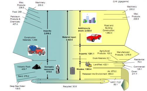
Material Flows on the Island of Hawai’i

A group of graduate students form the Center of Industrial Ecology at Yale University in 2005/2006 researched the material flows on the “Big Island of Hawai’i”. Their research report (which can be found on the website of the Kohala Center) shows two Sankey diagrams, one of which is shown here.

Material Flow Accounting (MFA) “is the study of material flows on a national or regional scale. It is therefore sometimes also referred to as regional, national or economy-wide material flow analysis.” (Wikipedia). MFA is a research field in industrial ecology. As the authors of the report write,

Using an island as a unit of analysis is valuable both to the researcher and to those interested in the sustainability of the island itself. The researcher benefits from the island’s clear boundaries (most often defined by a surrounding water body) and a relative advantage in data collection provided by the fact that borders are monitored. Material flows are therefore relatively easier to understand on islands than in larger, more complex non‐island systems.

I have been posting about the use of Sankey diagrams in MFA before, and with few exceptions (Material Flow Sankey Diagram of Japan), have found that examples of Sankey diagrams for national MFA accounts typically are limited to selected bulk materials (e.g. biomass in Switzerland, gold flows in the U.S.).

Flows in the above Sankey diagram for the island of Hawai’i are in gigagrams (kilotonnes) and refer to the year 2005. Inputs are shown on the left side, and the fate of those inputs can be seen as exits to the right. More than 75% of the material flows are imported from off the island, the majority of these flows (57%) are construction materials. Consequently, road and building construction are the largest net addition to stocks with almost 2,000 kilotonnes.

The Sankey diagram has some minor flaws, regarding scale of the flows. Look for example to the division of the landfilled waste arrow (422 kt) into three almost equal portions, which are supposed to represent 79.3 kt, 125.1 kt and 217.7 kt. Also the width of the volcanic rock input flow (429.7 kt) is about four times the width of the machinery input flow (representing 200.2 kt). Still, I think it is a good Sankey diagram, and I wouldn’t mind joining the research group on their next visit to the islands…

United States Annual Energy Review 2008

U.S. Energy Information Admmoinstration (EIA) now has the 2008 Annual Energy Review (AER) on their website. It contains Sankey diagrams for the nation’s overall energy flows (almost a “classic”) and four additional separate Sankey diagrams for petroleum, natural gas, coal and electricity.

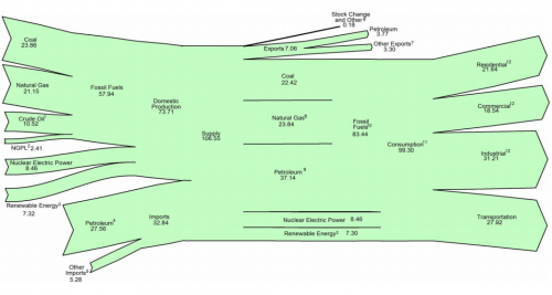
This is the U.S. Energy Flow diagram for 2008:

Check the original PDF file with the accompanying footnotes for further details. Overall energy consumption in 2008 was 99 Quadrillion BTUs (preliminary value, slightly down from the 101 Quadrillion BTUs in 2007.

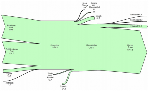
Among the other diagrams in the report, I chose to show the one for coal. 1121 mio. short tons have been consumed in the U.S. in 2008, mainly (1041 mio short tons) for electric power generation. The U.S. is a net coal exporter.

The diagram has a weird sinking downward feeling, caused by the fact that the main left-to-right orientation axis is not maintained. Looking at this it makes me want to shout out: “Hey coal Sankey, cheer up, life isn’t that black…!” 😉

The original full AER report (7.5 MB) can be found here.

U.S. Oil Import Sankey Movie

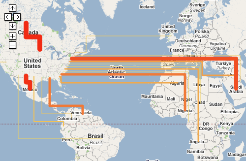
Renown Rocky Mountain Institute (RMI) founded in 1982 by Lovins and Lovins have an interactive oil imports map on their MOVE project webpage.

You can see the oil imports to the United States from January 1973 to August 2008 on a map that depicts the flow quantities as Sankey arrows linking the country of origin and the U.S. If you switch to the unit “Dollar”, you can see the value of the oil imported depicted as Sankey arrows.

One can play the the whole 35-year period as a movie, or use the slider on the time line to see individual months. The data used is from publicy accessible EIA/DOE statistics.

The United States is still 60 % dependent on imported oil. MRI’s MOVE project seeks possibilities to reduce foreign crude oil dependencies. The goal is to “get completely off oil by 2050, led by business for profit.”

Go to the RMI movie page and try it yourself. When I did the Lybia Oil Export map last year I wasn’t aware of this Sankey movie, which is of course much nicer.

World and US GHG diagrams from WRI

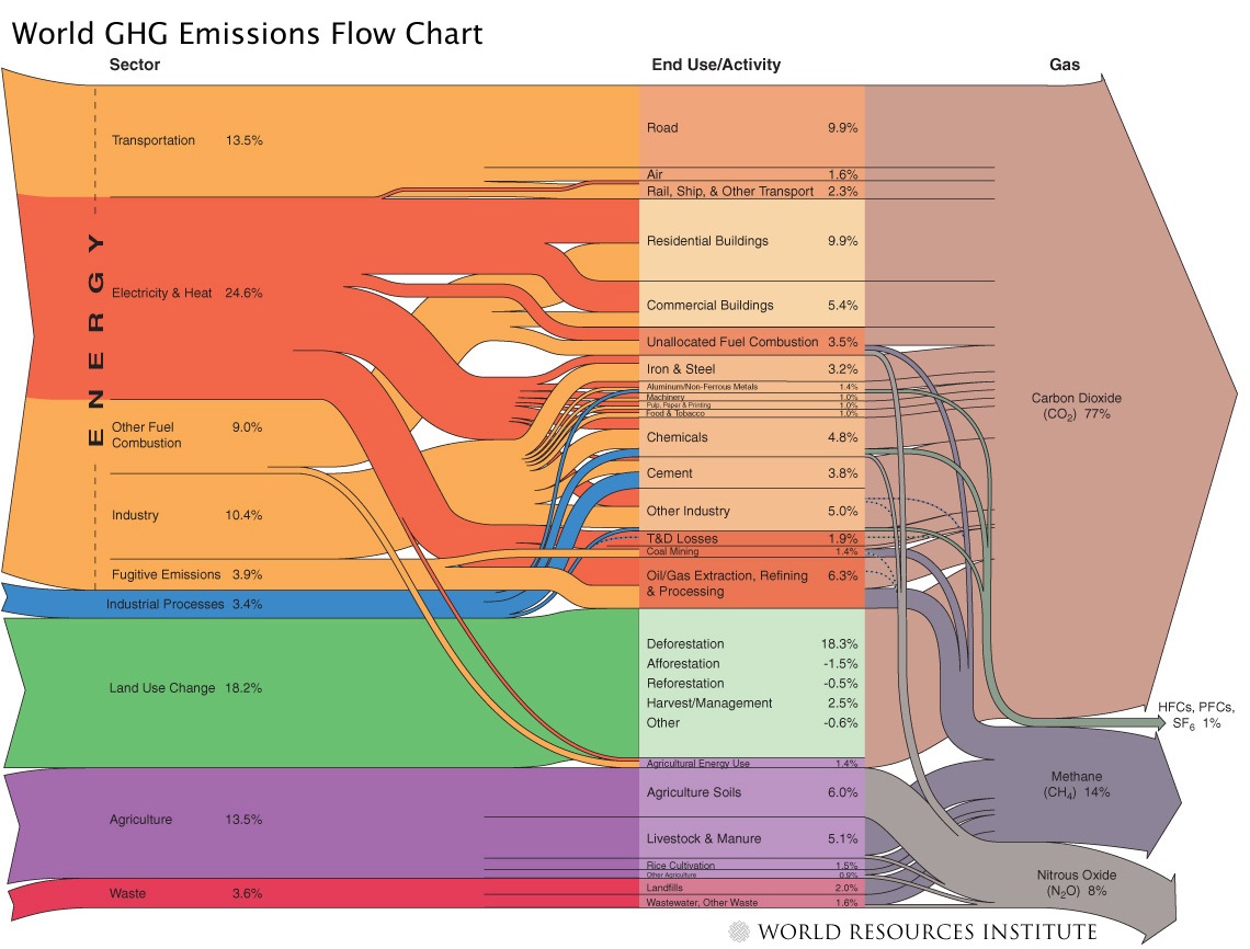
Last August I reported about a Sankey diagram showing World GHG emissions, published on the website of the World Ressource Institute (WRI). I couldn’t show the diagram due to copyright concerns in that post, but to my delight, Tim Herzog, co-author of the WRI publication and Director of Online Communciations at WRI in a comment to my post granted permission. Thanks, Tim!

So here it is:

The diagram shows the activity sectors from which of greenhouse gases (GHGs) originate. The largest portion is from energy generation (including transport), followed by land use change and agriculture. Direct emissions from other industrial processes (other than combustion processes) and waste is comparatively small. The arrows on the right side give a breakdown into the individual gases with carbon dioxide as the main greenhouse gas (77%) followed by methane and N2O.

All data is for 2000 and given in CO2 equivalents with the GWP 100a weighting factors for methane, nitrous oxides, HFCs and PFCs from the IPCC 1996 report. The total quantity is an estimate of 41755 MtCO2 equivalent. Land use change shows negative numbers too, because credits can be given for reforestation (newly planted trees absorbing CO2).

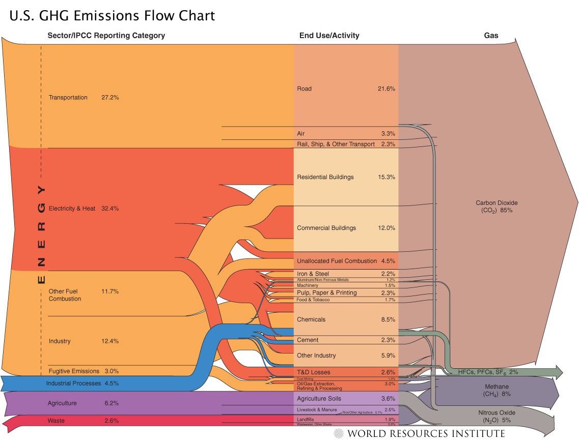
Here is the Sankey diagram from the same report just for the 2003 GHGs in the United States.

The overall CO2 equivalents are 6978 Mt in the US in that year, but the portion of GHGs from fuel combustion is higher. CO2 is 85% of the GHGs. For more details on the US GHG Sankey diagram, go to the WRI web page.

Kudos to the makers of these Sankey diagrams. Apart from the rich content they convey, they are also beautiful examples of how elegant Sankey diagrams can be.

Virginia Natural Gas Flow Sankey

The Virginia Center for Coal and Energy Research at Virgina Tech has a website on Virgina Energy Patterns and Trends (VETP).

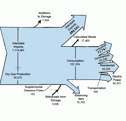
This summary page on natural gas features a Sankey diagram for natural gas flows in Virginia in 2005.


Flows are in million cubic feet. Note that the division line between dry gas production (88.610 million cubic feet) and interstate imports (1.114.460 million cubic feet) overemphasizes VA’s own production. Also the magnitude of the “consumption” flow and “interstate exports” are not to scale, probably owed to the desire of the designer to be able to split up the consumption arrow into separate arrows. The transportation arrow is exaggerated, and would only be a thin line if to scale.

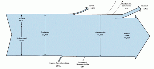
On the VETP summary page for coal, there is another interesting Sankey, also for 2005.

The second one also has some pecularities: The Sankey arrows for imports (15.764 thousand short tons) and exports (21.288 thousand short tons) of coal are not to scale, neither are the losses/unaccounted coal flows 4.951 thousand short tons.

Reminder to self: If I find the time I’ll do these two diagrams properly and to scale.

The man behind Sankey diagrams @ LLNL

The Council on Competitiveness has just called on the presidential candidates to come up with a national energy plan, believing that future economic growth and security of the United States depends on energy efficiency across the U.S. economy, sustainable energy solutions, and development of new technologies.

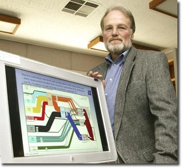
The new president might want to ask John Ziagos to advise him on energy issues. Ziagos is with the Energy & Environment Directorate at Lawrence Livermore National Laboratories, and an expert for energy scenarios. For me as a Sankey aficionado he is simply the “man behind the Sankey diagrams at LLNL”.

LLNL has been publishing energy flow diagrams for the U.S. over the last few years. In his public presentations (link1 – 2.9 MB, link2 – 4.8 MB) Ziagos impressively shows that even when implementing fuel cell technology for all vehicles, switching completely from coal and natural gas to renewable energy sources to generate the nation’s electricity, and building 270 new nuclear power plants … even then it would not be possible to stabilize U.S. carbon emissions between now and 2050. “If we want to move toward a carbonless future, no single technology will do – everything counts.” Ziagos says.

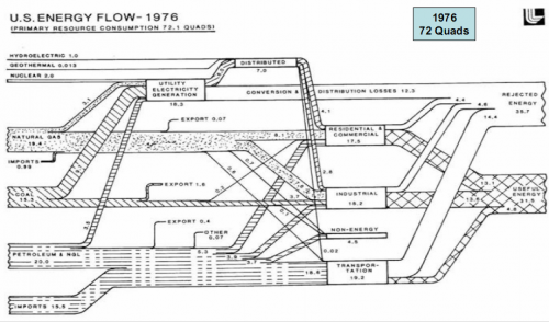
I am reproducing two energy flow diagrams for the U.S. from John’s presentations below. The first is for 1976…

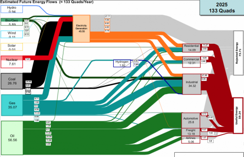
… the second a 2025 projection:

While overall energy produced will rise from 72 Quads in 1976 to an estimated 133 Quads p.a. in 2025 [Note: 1 Quad(rillion) equal to 10E15 BTU, or 1.055 × 10E18 joules (1.055 exajoules or EJ) in SI units.], the ratio of useful energy to rejected energy gets worse.

U.S. Freshwater Withdrawals in 2000

I had bookmarked a number of Sankey diagrams a while ago when visiting the website of Lawrence Livermore National Laboratory. These diagrams on energy, CO2 and freshwater are a great source of information. You can, for example, find the typical energy Sankey diagrams (like the one in my previous post) for the U.S. all the way back to 1950, 1960 and 1970 and then from 1973 to today.

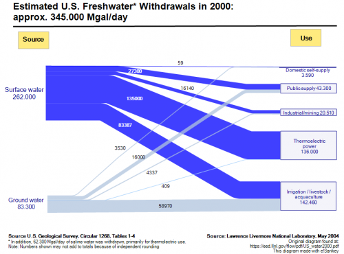
Summer is coming closer, and we can again expect water shortage in some states. So the Sankey diagram I have selected for presentation today (original PDF), is for freshwater withdrawals in the year 2000.

The overall extraction was 345.000 Mgal/day (roughly 1.3 bio litres per day) with approximately 75 % from surface water and 25 % from ground water. Another 62.300 Mgal/day of saline water is withdrawn for thermoelectric use.

The largest portion of the water is for irrigation, livestock and aquaculture, closely followed by the water used in thermoelectric power generation. Domestic self-supply is a comparatively marginal 3,590 Mgal/day (1,04 %), which makes my Mom’s call to “close the tap” sound somewhat ridiculous.