Tag: phosphorus

Show it with Sankey Diagrams

Phosporus in the natural environment and the food chain has been a topic of several posts on my blog. So it didn’t come as a surprise to find yet another diagram on phoshphorus flows over at Nels’s MFA Diagram blog (one of the blogs I follow closely, see blogroll).

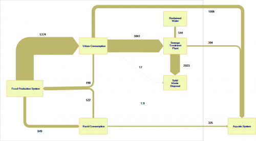
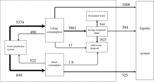
MFA diagrams have their focus on the nodes and the build-up of stocks. Sometimes they get a touch of Sankey diagram with the arrows having different magnitudes. The MFA diagram below is for phosphorous flows in China 2008 (original source: Min Qiao, Yuan-Ming Zheng, Yong-Guan Zhu, 2011. Material flow analysis of phosphorus through food consumption in two megacities in northern China). Values are in tonnes.


(click image to enlarge)

We can detect arrows with three different brush widths (my guess is 1px, 2px and 4 px), each standing for a value range into which the actual flow quantity falls. This may, however, bes somewhat misleading when having a quick glance at the diagram.

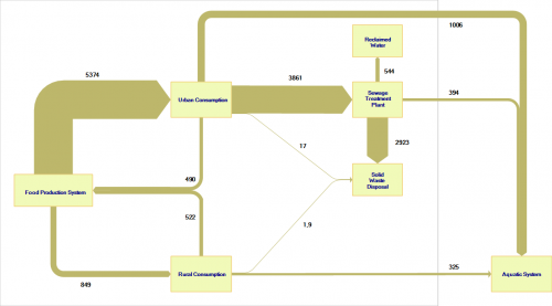
I quickly “translated” the above diagram to a Sankey diagram with flow values being actually to scale.


(click image to enlarge)

Here it is quite clear where the major phosphorus flows are located (from food production via urban consumption to sewage treatment plant and solid waste disposal: 2923 out of 5374 tons end up here). The other flows are comparatively small, with the phoshporous flow going directly to the aquatic system worth a mention. Two small flows in the center of the diagram are negligible, they are in fact so tiny in comparison to the major flows that they even don’t show up (or just as a hairline) here.

I have therefore added a minimum width of 1 px for small flows so that the annual 17 tons from urban consumption and the 1.9 tons from rural consumption to the solid waste disposal are at least visible (albeit not to scale with the other flows any more).


(click image to enlarge)

Final phosphorous sinks are solid waste disposal (landfill?) and the aquatic system.
Phosphorus Flows in the U.S.

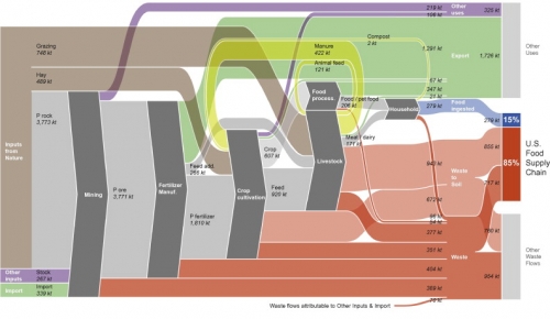
Following up to my last post, here is another Sankey diagram for phosphorus flows. This one is by Jason Pearson, TRUTHstudio and can be found in the ‘Visualization’ section of his website. Jason is also the designer of the Economy Maps (see this March 2012 post).

Jason says that “the diagram demonstrates the key point: that only 15% of the phosphorous in the US food supply chain is ingested, with the remainder ending up as waste. The diagram also shows the proportion of phosphorous used or wasted in non-food supply chains”

This one is more colorful than the Dutch one. Flows are in kt (kilotons). It has a left-to-right orientation (the other was vertical) and is very compact with almost no space betweend the bands, almost like in a block-style diagram. As a concession to this dense style, diagonal arrows don’t maintain their width.

Phosphorus Flows in the Netherlands

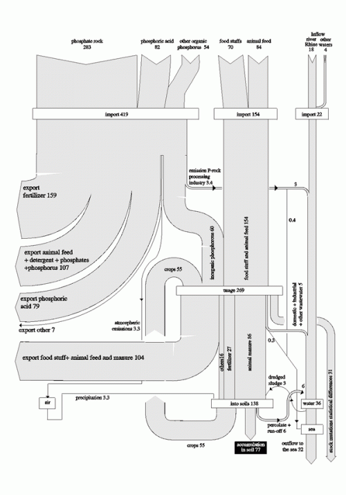
A recent visit to an organic farm and a chat with one of the staff on peak phosphorus made me search for Sankey diagrams on phophorus flows. Managed to find two, one of which is shown below. It is from an article ‘Phosphate recovery from animal manure the possibilities in the Netherlands’ by Van Ruiten Adviesbureau / Projectbureau BMA, for CEEP (November 1998) and shows phosphorus flows in the Netherlands in 1995 in million kg-P.

“It can be seen that 84 million kg P are imported in cattle feed alone (roughly 1/3 of the amount of P that is imported in phosphate ore). The excretion of phosphorus in animal manure is 86 million kg P according to the chart (about 197 million kg P2O5) … Moreover the figure shows that discharges of household and industrial waste water contain 10 million kg P. This is about 1/10 of the amount of P in animal manure.”

OK, this ia black/white retro style, but nevertheless a good Sankey diagram with flows to scale. Three vertical “columns” are for actual phosphorus imports: The largest quantity is direct imports (from phosphate rock, as phopshoric acid, and other organic phosphorous). The middle import column is for phosphorus embodied in food stuffs and animal feed. The third import pathway into the Netherlands is in waterways, such as the Rhine river, but this fraction remains unused. A large quantity of phosphorus is exported again (flows branching out to the left). 77 million kg-P per year accumulate in the soil. Another interesting detail is the flow labeled “stock mutations and statistical differences” branching out to the right.

Also see this post with a nitrogen flow Sankey diagrams from the Netherlands.

I will dig out the other phophorus Sankey and present it here in the near future…

Making it look nicer…

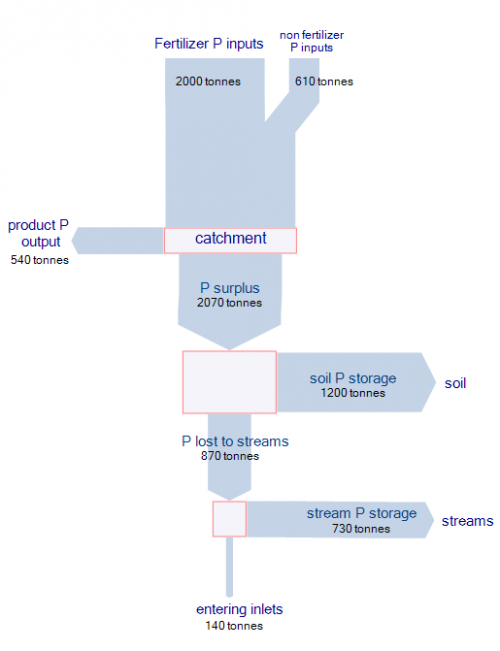
Reading on one of my favorite blogs actually made me take a harder stance on the Sankey diagram I presented in my last post. Following Kaiser’s attitude of making it better rather than only criticizing, I redesigned the Sankey diagram of phosphorus flows in the Peel-Harvey catchment area.

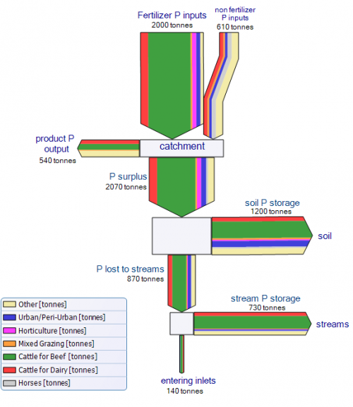
In the first version I didn’t differentiate the various sources of phosphorus, but only used one color for the overall flow quantity. Introducing nodes dramatically improves the comprehensibility and the mass balance check for the flows branching off sideways. There is some redundancy in the labeling of the flows, but I left it to stick as close to the original Sankey diagram as possible.

The second Sankey diagram is even closer to the original one. I tried to match the colors as much, and also introduced a legend. Please note that, since I didn’t have access to the raw data, I just approximated the flow values. Because of the multi flow arrows, I decided to leave a border line at each arrow, and to put heads to the first two input flows (‘fertiliser P input’ and ‘non fertiliser P input’) to better be able to distinguish them.

Sankey for Phosphorus Flows and their Origins

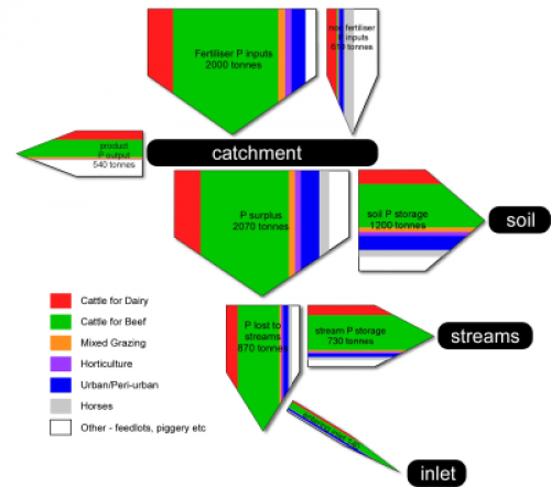
A paper on ‘Guiding BMP adoption to improve Water Quality in various Estuarine Ecosystems in Western Australia’ by Nardia Keipert from the University of Western Australia’s Department of Agriculture and Food shown on the ARWA Ecohydrology website features a Sankey diagram on phosphorus flow in a catchment area.

The stacked Sankey arrows show “the relative contribution from each land use sector”. The origins of the nutrients are cattle for dairy, cattle for beef, mixed grazing, horses, and others. From statistical data on nutrient use efficiency, which ranged from 10 to 50 %, the researchers estimated the accumulation of phosphorus in the soil and streams, and the final delivery into the ocean.

The Sankey diagram does look kind of … errh, how should I say, …. “different”. But this is mainly due to the fact that flows that accumulate in a storage branch off to the side. The arrow magnitudes are actually to scale. To check this, add the horizontal flow to the storage and the vertical flow.

The full report is here, the Sankey diagram is shown on page 8.

Update: see my followup post to this