Month: November 2009

Follow the Money Sankey Diagram

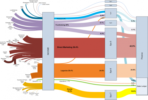
The Visio Guy had another cool Sankey diagram on his blog last week. Credits go to Chris Webb of Woodland Trust, who created this using the line thickness option rather than pre-wired shapes.

The diagram has a left-to-right orientation and shows the different sources of money received by the trust. The types of funds (e.g. grants, legacies, direct marketing) are grouped together by colors. Flows have percentile values, rather than absolute ones. I am not sure what the boxes labeled “Sys” are, but the colors change. All flows merge into the box “Finance” which has a subgroup “Sales Ledger”.

The flow bands between most of the nodes have a nice soft curving. This is why some people do refer to Sankey diagrams as spaghetti diagrams.

If you are using Visio, you can download this diagram and look how it has been done. Nice work! I hope to see more of these Sankey diagrams done in Visio….

Energy optimized heating system

This website on energy optimized building features a case study of a students dorm building at Wuppertal, Germany. [On a side note: it is quite striking that when I browse for new Sankey diagrams on the web, I come across them on German websites. Herr Sankey could well have been a German…]

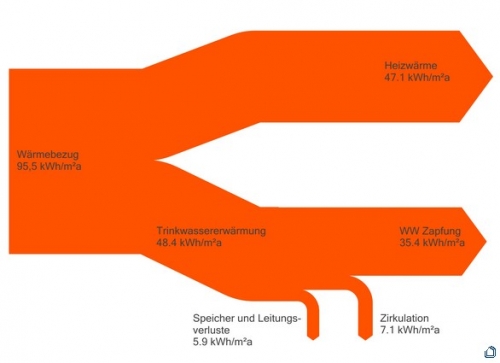
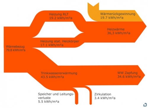
The two Sankey diagrams shown along with the article visualize the heat energy flows before and after the optimization measures taken.

before:

after:

Flows are in kWh per square metre per year. The first diagram breaks down heat consumption into heat used for room heating and for warm water preparation. In the second a new heating system has been installed providing heat mostly over the air circulation system. Only some static radiators remain. [Thanks Thomas for helping me with the translation/explanation].

Apart from the use of a fancy color, the Sankey diagrams are well done and comprehensible. Flows are to scale.

Cartographia blog shows Minard maps

In 2008, the Cartographia blog started a post series called ‘Monday’s with Minard’. Some people consider Charles Joseph Minard the first to use arrow magnitude in his diagrams to represent quantities. (As a consequence, this means that Sankey diagrams would have to be renamed to Minard diagrams!).

What differentiates Minard maps from Sankey diagrams is that Minard’s fine works always have a geographical relation. The most famous one is his Map of Napoleon’s march to Moscow published in 1869. This “carte figurative des pertes successives en hommes de l’Armée Francaise dans la campagne de Russie 1812-13” shows number of men (as width of arrows), geographic movement of the troops on the map both for invasion as well as for retreat, as well as time and temperature on a separate scale.

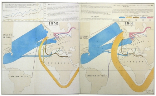
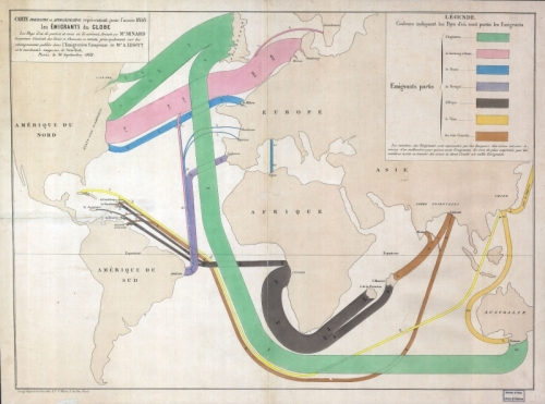
Cartographia blog has some other nice examples, two of which are shown here:

The first shows migration patterns across the globe. Arrows do not have an arrow head but the country of emigration is color coded. The outline of the countries is distorted to accomoadate large flows connected to them. For a detailed description please consider reading the original blog post. This map is similar to the one I showed in this post.

The other is a flow map for wool and cotton for the years 1858 and 1861. “Blue represents cotton and wool from the United States, the orange from British territories in South Asia … One millimeter represents 5,000 tons of cotton or wool.”. As one can see on the 1861 map, cotton imports from Asia have increased dramatically. See the description of the map in the blog post on Cartographia blog.

See all Monday’s with Minard posts here. There has been no activity on the blog since June 2008. I hope to see more of these posts some day.

Material Flows on the Island of Hawai’i

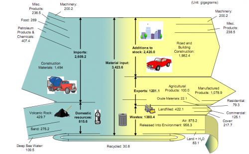
A group of graduate students form the Center of Industrial Ecology at Yale University in 2005/2006 researched the material flows on the “Big Island of Hawai’i”. Their research report (which can be found on the website of the Kohala Center) shows two Sankey diagrams, one of which is shown here.

Material Flow Accounting (MFA) “is the study of material flows on a national or regional scale. It is therefore sometimes also referred to as regional, national or economy-wide material flow analysis.” (Wikipedia). MFA is a research field in industrial ecology. As the authors of the report write,

Using an island as a unit of analysis is valuable both to the researcher and to those interested in the sustainability of the island itself. The researcher benefits from the island’s clear boundaries (most often defined by a surrounding water body) and a relative advantage in data collection provided by the fact that borders are monitored. Material flows are therefore relatively easier to understand on islands than in larger, more complex non‐island systems.

I have been posting about the use of Sankey diagrams in MFA before, and with few exceptions (Material Flow Sankey Diagram of Japan), have found that examples of Sankey diagrams for national MFA accounts typically are limited to selected bulk materials (e.g. biomass in Switzerland, gold flows in the U.S.).

Flows in the above Sankey diagram for the island of Hawai’i are in gigagrams (kilotonnes) and refer to the year 2005. Inputs are shown on the left side, and the fate of those inputs can be seen as exits to the right. More than 75% of the material flows are imported from off the island, the majority of these flows (57%) are construction materials. Consequently, road and building construction are the largest net addition to stocks with almost 2,000 kilotonnes.

The Sankey diagram has some minor flaws, regarding scale of the flows. Look for example to the division of the landfilled waste arrow (422 kt) into three almost equal portions, which are supposed to represent 79.3 kt, 125.1 kt and 217.7 kt. Also the width of the volcanic rock input flow (429.7 kt) is about four times the width of the machinery input flow (representing 200.2 kt). Still, I think it is a good Sankey diagram, and I wouldn’t mind joining the research group on their next visit to the islands…