Category: Samples

Alaska Energy Flows

Dug out a folder on the hard disk of my old computer where I had stored many Sankey diagrams. Great stuff there I had saved years ago. Problem is that at the time I didn’t label the diagrams properly, so that I am now trying to trace where I got them from.

Here is one I like quite a bit. It is featured on p. 24 of the Alsaka Energy Plan (available on the Alaska Energy Authority (AEA) website / directly access large PDF)
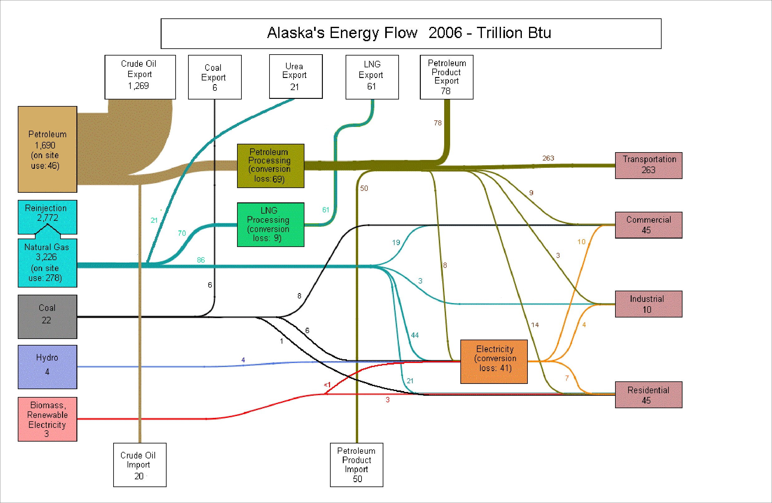
Alaska Energy Flows for 2006 in trillion BTU. Forget about the other fuels, this state’s energy is almost entirely based on crude. And – despite being an importer of oil – AK is primarily an exporter of oil. All other energy flows really seem to be insignificant because of the dominance of oil. Losses are not shown with streams, but rather are given as text on the node.

Energy Efficiency in Manufacturing Processes

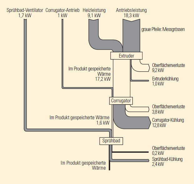
A brochure on efficient use of energy in manufacturing processes in industry was published in 2004 by Bavarian environment agency (LFU). With its catchy title ‘Protect Climate – Reduce Costs’ (German: ‘Klima schützen – Kosten senken’) the brochure targets at small and medium sized companies and aims to raise conciousness about energy efficiency in different areas of a manufacturing company such as pressurized air, air condition, heating/cooling, lighting and others.

On page 6 this Sankey diagram shows an overview of energy flows in the company…

… and on page 7 a detailed view of a process section (extruder, corrugator, spray bath)

The first diagram is in percent of the total energy consumption, directing the interest to the areas that contribute most to energy consumption, losses (and energy costs) in the company. In the second diagram the unit is kW.

Thanks to the blog reader who sent in the brochure and helped out in translating from German.

Solvents in Pharmaceutical Synthesis

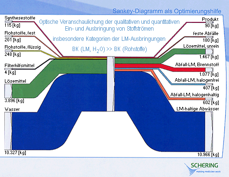
This simple Sankey diagram is displayed on the Berlin state environmental protection agency (in German only). It shows a breakdown of the input materials and of the outputs of a pharmaceutical synthesis process, with a focus on solvents (“LM”).

Water is the largest chunk of the inputs, as well as on the output side (I understand that the water is polluted with solvents after the synthesis and need special treatment).

Flows are in kg, and mostly to scale. The Sankey arrows for the smaller quantities like the actual product yield (90 kg only) seem to have a minimum width or are emphasized ny a stromger border line in order to remain visible.

Misc Sankey Diagrams Uncommented 05

I had to stop posting for a few days because I had trouble with page hijacking. Set up WP anew with the help of a friend (thanks Chris!). To get going again after this break, here’s a misc Sankey diagram from my collection:

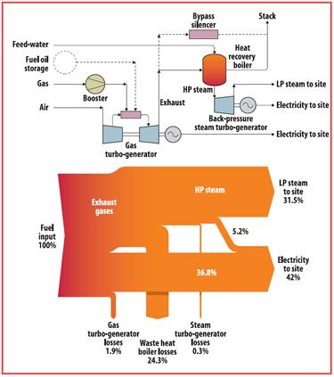
The upper part depicts a process diagram of a gas-powered steam boiler system. Below are the energy flows as a Sankey diagram. Values are in percent, showing the yield. Out of the input energy (100%) we have 31.5% of the energy in low presseure steam and 42% in electric energy. Don’t know where I picked this duiagram from, will have to check if I find the source of this.

Sankey for Building Performance Simulation

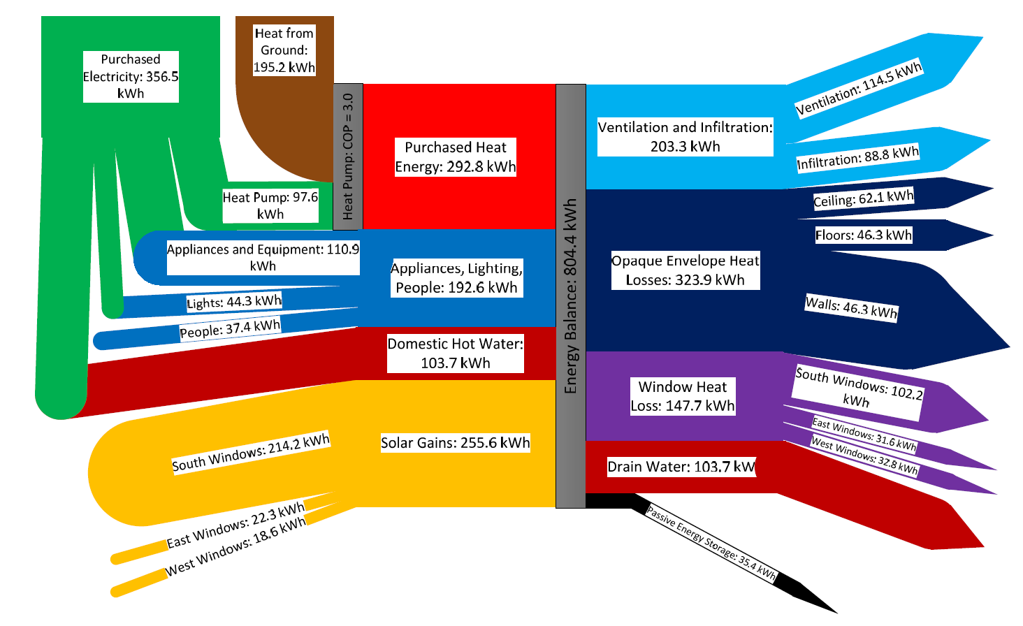
Found this via utsapocalypse. The Sankey diagram is originally from the article ‘Preliminary Investigation of the Use of Sankey Diagrams to Enhance Building Performance Simulation-Supported Design’ by William (Liam) O’Brien of Carleton University, Ottawa.

The paper proposes “the outline for a methodology for creating Sankey diagrams to represent energy flows in buildings, with the eventual intent that the methodology be integrated into a software tool.”

The Sankey diagram shows the energy balance of a house for a mid-winter week. Flows are in kWh, total amount 804 kWh. Energy sources/types are from the left (purchased heat, domestic hot water, solar gains), energy consumption and losses to the right (heat loss through windows, ceilings, walls).

Plenty of colors used in the diagram, Sankey arrows glued together from shapes. As the author mentions “the underlying creation process, when performed manually, can be quite complex”.

Summer Time Sankey: Ice, ice, baby!

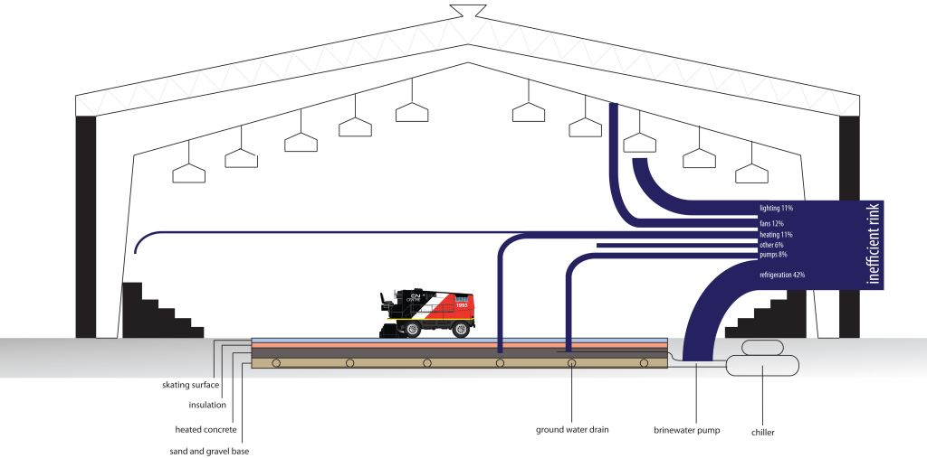
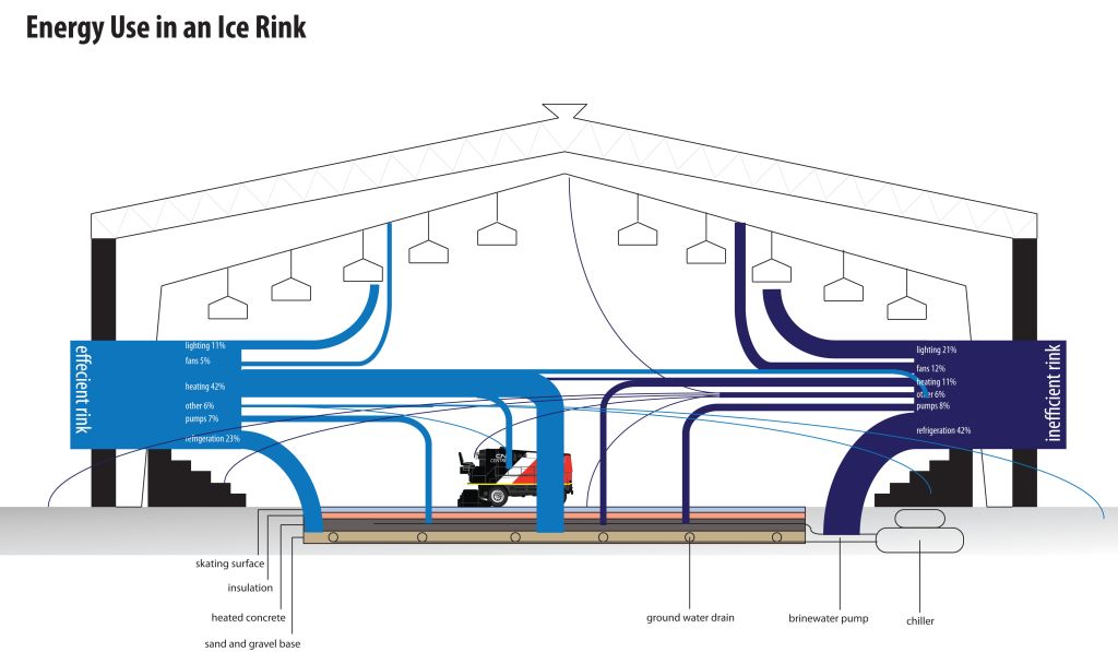
The charchitecture blog is run by a “third year architecture student in Bill Sherman’s Building, Sites and Systems course”. The below Sankey diagrams are from a November 2011 post and covers the topic of refrigeration.

The first Sankey diagram depicts a cross section of an ice rink and shows a breakdown of the energy use in an inefficient ice-rink.

In the second Sankey diagram an efficient and an inefficient ice-rink are compared.

Sankey arrows represent relative shares in percent, not absolute values. Hence in the second figure the height of the stacked Sankey flows (100%) is the same for the inefficient as for the efficient ice-rink. I think that a direct comparison of the energy consumption is not intended here, but only the different distributions.

The original post has more basic information on refrigerations and explains technologies that can be used to save energy.

Now that’s cool… my summer time post for you.

Freshwater Consumption and Distribution

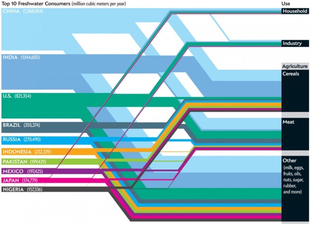
The below distribution diagram (aka ‘Spagehetti diagram’) was presented on flowing data. It shows the top 10 nations in regard to freshwater consumption on the left, and the sectors where water is consumed on the right (column “Use”).

The author of the diagram is Jen Christiansen and it was originally published in a Scientific American article by Mark Fischetti.

The unit is million cubic metres per year. Only the absolute water consumption per nation is given, no values for the water consuming activities. Many of the commentators of the post pointed out that a per capita consumption of water would give a different, a “fairer” picture.

I refrain from commenting the content of the graphic. But I like the clear layout with the bands running in parallel and nicely stacked.

FOE Diagram: Up in Smoke

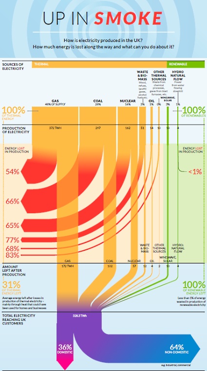
Friends of Earth have published this Sankey diagram produced by ‘Information is Beautiful’ on their webpage on July 6. It shows how energy is wasted in the United Kingdom. It shows that “huge amounts of energy are wasted every day in our gas, coal and nuclear power stations” and, in fact, “over half of the energy in gas and around two thirds of the energy in nuclear and coal used to produce electricity is lost as waste heat.”

The diagram is based on data from Department of Energy and Climate Change, DUKES 2011 and Energy Saving Trust 2012. Absolute figures are given for the different sources at the top in the diagram, and for the amount of energy “left after production” (328.3 TWh). So mainly it is the (non-)efficiency of the production expressed as relative percentage figures that is shown.

One interesting thing about this energy flow Sankey is that it distinguishes between “Thermal” (yellow) and “Renewable” (green) sources of electricity. This is in contrast to the classic renewable/non-renewable split, since in this diagram biomass falls under thermal sources. Interesting.

High-res PDF with the diagram can be found here. There is also another Sankey diagram in the original PDF that shows the consumption of energy in private homes. Will show that one in a separate post some other time.