Sankey for Building Performance Simulation

Found this via utsapocalypse. The Sankey diagram is originally from the article ‘Preliminary Investigation of the Use of Sankey Diagrams to Enhance Building Performance Simulation-Supported Design’ by William (Liam) O’Brien of Carleton University, Ottawa.

The paper proposes “the outline for a methodology for creating Sankey diagrams to represent energy flows in buildings, with the eventual intent that the methodology be integrated into a software tool.”
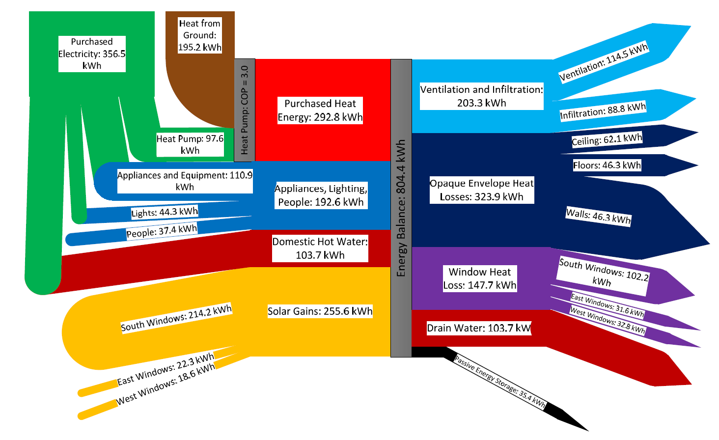
The Sankey diagram shows the energy balance of a house for a mid-winter week. Flows are in kWh, total amount 804 kWh. Energy sources/types are from the left (purchased heat, domestic hot water, solar gains), energy consumption and losses to the right (heat loss through windows, ceilings, walls).

Plenty of colors used in the diagram, Sankey arrows glued together from shapes. As the author mentions “the underlying creation process, when performed manually, can be quite complex”.
Summer Time Sankey: Ice, ice, baby!

The charchitecture blog is run by a “third year architecture student in Bill Sherman’s Building, Sites and Systems course”. The below Sankey diagrams are from a November 2011 post and covers the topic of refrigeration.

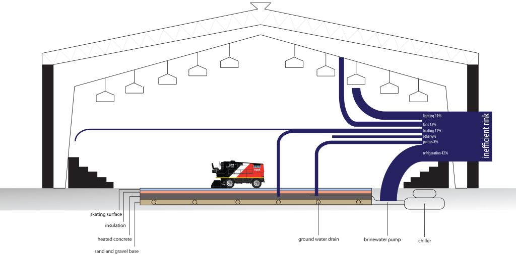
The first Sankey diagram depicts a cross section of an ice rink and shows a breakdown of the energy use in an inefficient ice-rink.

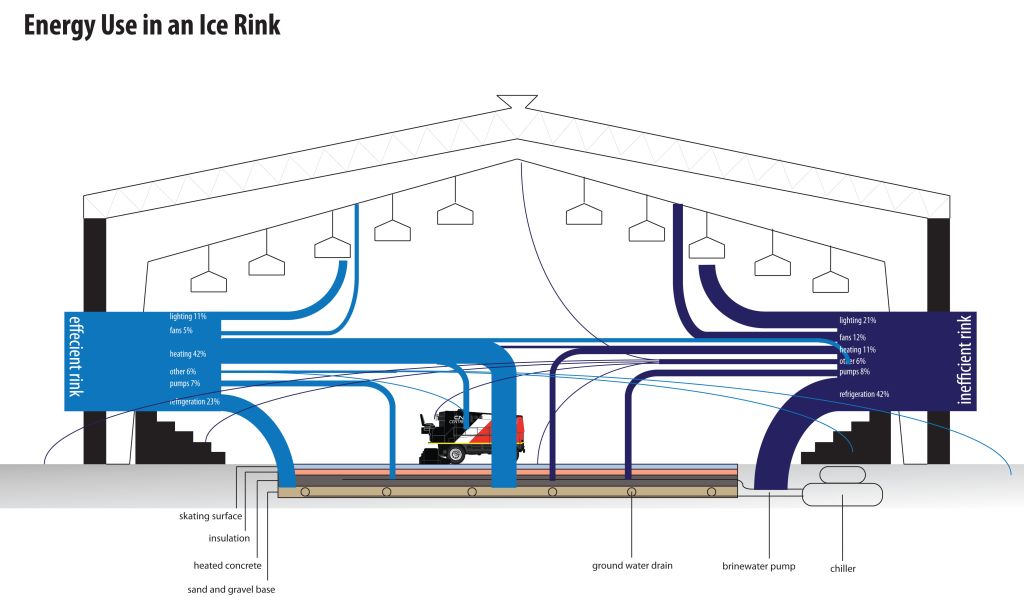
In the second Sankey diagram an efficient and an inefficient ice-rink are compared.

Sankey arrows represent relative shares in percent, not absolute values. Hence in the second figure the height of the stacked Sankey flows (100%) is the same for the inefficient as for the efficient ice-rink. I think that a direct comparison of the energy consumption is not intended here, but only the different distributions.

The original post has more basic information on refrigerations and explains technologies that can be used to save energy.

Now that’s cool… my summer time post for you.

Freshwater Consumption and Distribution

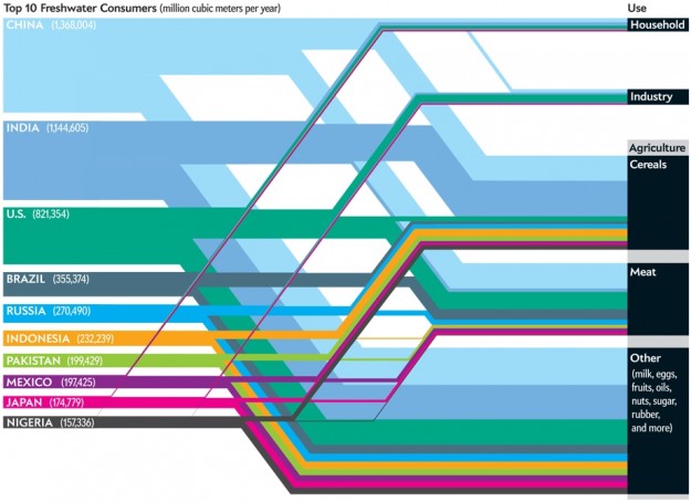
The below distribution diagram (aka ‘Spagehetti diagram’) was presented on flowing data. It shows the top 10 nations in regard to freshwater consumption on the left, and the sectors where water is consumed on the right (column “Use”).

The author of the diagram is Jen Christiansen and it was originally published in a Scientific American article by Mark Fischetti.

The unit is million cubic metres per year. Only the absolute water consumption per nation is given, no values for the water consuming activities. Many of the commentators of the post pointed out that a per capita consumption of water would give a different, a “fairer” picture.

I refrain from commenting the content of the graphic. But I like the clear layout with the bands running in parallel and nicely stacked.

FOE Diagram: Up in Smoke

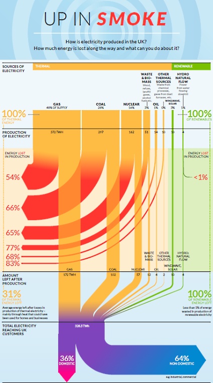
Friends of Earth have published this Sankey diagram produced by ‘Information is Beautiful’ on their webpage on July 6. It shows how energy is wasted in the United Kingdom. It shows that “huge amounts of energy are wasted every day in our gas, coal and nuclear power stations” and, in fact, “over half of the energy in gas and around two thirds of the energy in nuclear and coal used to produce electricity is lost as waste heat.”

The diagram is based on data from Department of Energy and Climate Change, DUKES 2011 and Energy Saving Trust 2012. Absolute figures are given for the different sources at the top in the diagram, and for the amount of energy “left after production” (328.3 TWh). So mainly it is the (non-)efficiency of the production expressed as relative percentage figures that is shown.

One interesting thing about this energy flow Sankey is that it distinguishes between “Thermal” (yellow) and “Renewable” (green) sources of electricity. This is in contrast to the classic renewable/non-renewable split, since in this diagram biomass falls under thermal sources. Interesting.

High-res PDF with the diagram can be found here. There is also another Sankey diagram in the original PDF that shows the consumption of energy in private homes. Will show that one in a separate post some other time.

Something went wrong here…

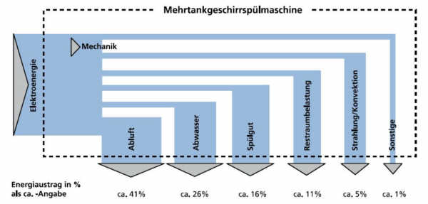
As some of you might know, I also like to post a diagram from time to time that has, … mmmh, say …. has the potential of being improved. This one, found on the website of a German consulting firm, is such an example.

.

I am glad they don’t call this a Sankey diagram anywhere. Everything that could go wrong did go wrong here. The horizontal arrow segments all have the same width, probably due to the fact that the diagram was prepared by combining rectangles. The added outflows that leave vertically at the bottom are much wider than the horizontal first segment. And the outflows are not to scale when being compared among each other (check the 5% arrow commpared to the neighnouring 11% arrow that should have roughly the douuble width. OMG!

Process Heat from Solar Power

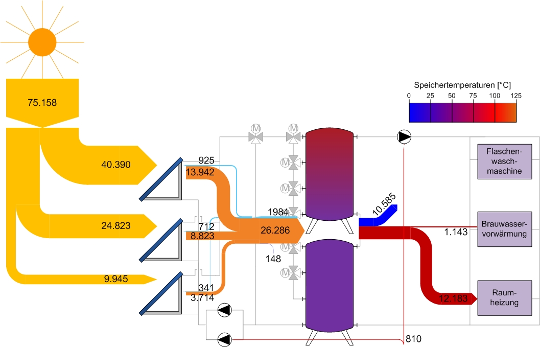
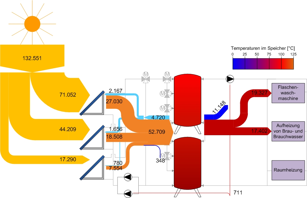
Managed to translate most from a website on process heat from solar systems installed in a brewery I had found recently. (again a Sankey diagram from a brewery!). The article sports four different Sankey diagrams for the energy flows in the brewery: one for the entire calendar year 2010, and three further ones for January (winter mode), March (transition period) and July (summer mode) of the same year. This work at Hofmühlbrauerei Eichstätt brewery was apparently supported by Technical University of Chemnitz.

March:

July:

Energy is obtained from three different solar collector fields with different harvest. Flows are in kWh. Energy harvest in March was 75.158 kWh, and in July went up to 132.155 kWh. A description of the whole system and photos can be seen on this page (text in German only).

There are three consumers (the three pink boxes at the right)) that each have different demands depending on the season: Indoor heating (“Raumheizung”), brewing water and domestic water pre-heating (“Brau- und Brauchwasservorwärmung” – Google Translate didn’t help me on this one…) and warm water for the bottle washing machine (“Flaschenwaschmaschine”).

While in winter most of the energy from the solar collector system is directed to indoor heating, in summer it is the opposite: since no indoor heating is needed the whole energy harvest can go to water heating for the other machines. The storage tanks also have a color scheme indicating the temperature.

Very nice! Good work!

Water Footprint Sankey Diagram

Water footprinting has been a hot topic in the last two or three years. Water use for the production of a product, ot the water consumption of an individual, a business, or a nation are referred to as water footprint. A mere volumetric water fooprint is the simplest version, but more elaborate methods for assessing the impact on the water system have also been developed (e.g. Hoekstra, Pfister, Milà i Canals). The water footprint is also finding its way into Life Cycle Assessment with some impact assessment methods being expanded to cover the water issue.

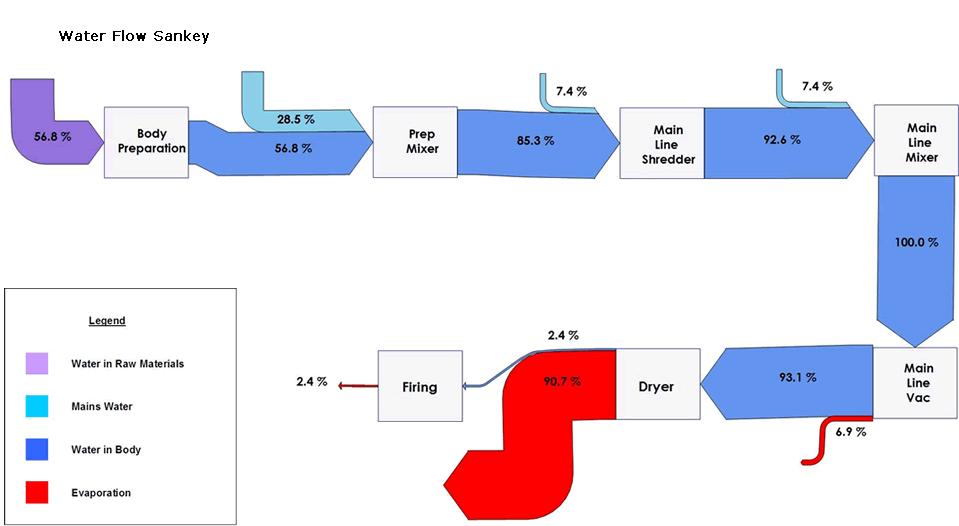
The below is a simple Sankey diagram of embodied water. It has been published on the website of consultancy firm Ceram. Ceram conducted a water use study at the Wienerberger brick production site with a gate-to-gate perspective. So this is far from being a full water footprint, as it covers only the processes on-site, but nevertheless it is one of the first examples of a Sankey diagram being applied in that domain. [Anyone knows of other water footprint Sankey diagram examples, please let me know.]

There are no absolute values, but only percentage shares of water intake, water embodied in the product and evaporation. Only a small fraction of the water contained in the (wet) brick mass remains in the final bric (2.4%) with the larges fraction evaporating in the drying process.

Denmark 2050 Nuclear Free Energy Scenario

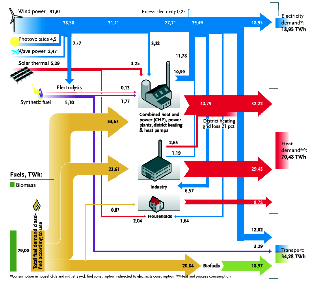
Found the below Sankey diagram in an article titled ‘La politique énergétique du Danemark. Vers un scénario 100% renouvelable en 2050’ by Thierry de Larochelambert of Institut FEMTO-ST via sortirdunucleaire.org.

The article says: “Le diagramme de Sankey (synoptique) ci-dessous illustre les flux d’énergie produites, converties et consommées par secteurs dans la structure énergétique proposée par le Plan Climat IDA à l’horizon 2050. [Translation: The synoptic Sankey diagram below illustrates the energy flows that are produced, converted, and consumed by the different sectors, as proposed in the IDA Climate Plan with a time horizon 2050]”

Units are in terawatt hours (TWh) and relate to one year. The primary energy supply is 112.86 TWh. Some tiny flaws in the Sankey diagram, such as overlapping flows, arrow heads that overemphasize large arrows, and an issue with rectangular bends. But overall a very good Sankey diagram that gets the message across. Definitely worth a fav point…

The 2050 scenario by IDA foresees a nuclear free, 100% renewable energy production with biomass and wind power being the main energy souces. As the article explains, the transition from 50% to 100% independence between 2030 and 2050 is an extraordinary technical, scientific and economic challenge (“un défi technique, scientifique et économique extraordinaire”, p. 6) that will require some measures to be implemented, such as a 10% drop in electric energy demand, and a shiftover of 50% of Danish freight transports being moved to rail.

Exciting article. For those of you who read French: here it is. The original ‘IDA Climate Plan 2050 by the Danish Society of Engineers (IDA) where this Sankey diagram was first published is here (in English).