Distribution Diagram from Excel Data

Bruce from http://ramblings.mcpher.com writes about “how to free your Excel data from your desktop and take advantage of web capabilities such as Docs, Maps, Earth, Gadgets, Visualizations and a whole bunch of other services”. His last contribution is on Sankey Diagrams from Excel, for which he uses d3.js and some work previously done by Mike Bostock.

While I don’t fully agree with Bruce’s definition of Sankey diagrams (“What are Sankey Diagrams? They are designed to show the movement in a network over time.”), this sure is good stuff and great work. You can download the VBA code from his page directly.

Distribution Diagrams (aka ‘Spaghetti Diagrams’) can be created directly from Excel. The interactive version (follow link above image on this page) allows to rearrange the nodes within the same column, and individual bands are highlighted on mouse over.
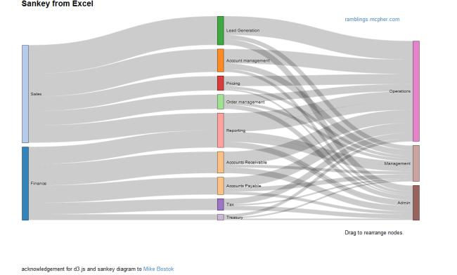
Why don’t these fully qualify as Sankey diagrams, in my opinion? Why would I rather call them distribution diagrams? It is exactly the fact that these are not directed flows, but rather quantities that are distributed over categories (or dimensions). There is no time relation in them, neither are there flows “from” (e.g. Finance) “to” (e.g. Reporting) or the other way round. These are bands hooked between nodes rather than arrows leading from one node to another. Each category could be represented by a pie chart as well … which would be more boring, of course. No unit given for the value of the flow (I guess it could be US$), but this is not even necessary, as the sum of the bands add up to 100% (like in a pie chart). For those of you interested, I recommend to read on the Parsets page.

Have added Excel to Sankey (based on d3.js) to the software list.
Energy Management in a Company

Even before the 2011 release of the ISO 50001 energy management standard, which lists Sankey diagrams as one tool for energy analysis, companies and consultants have been using them in energy efficiency and energy management projects. Many published examples come from Austria, like this one.

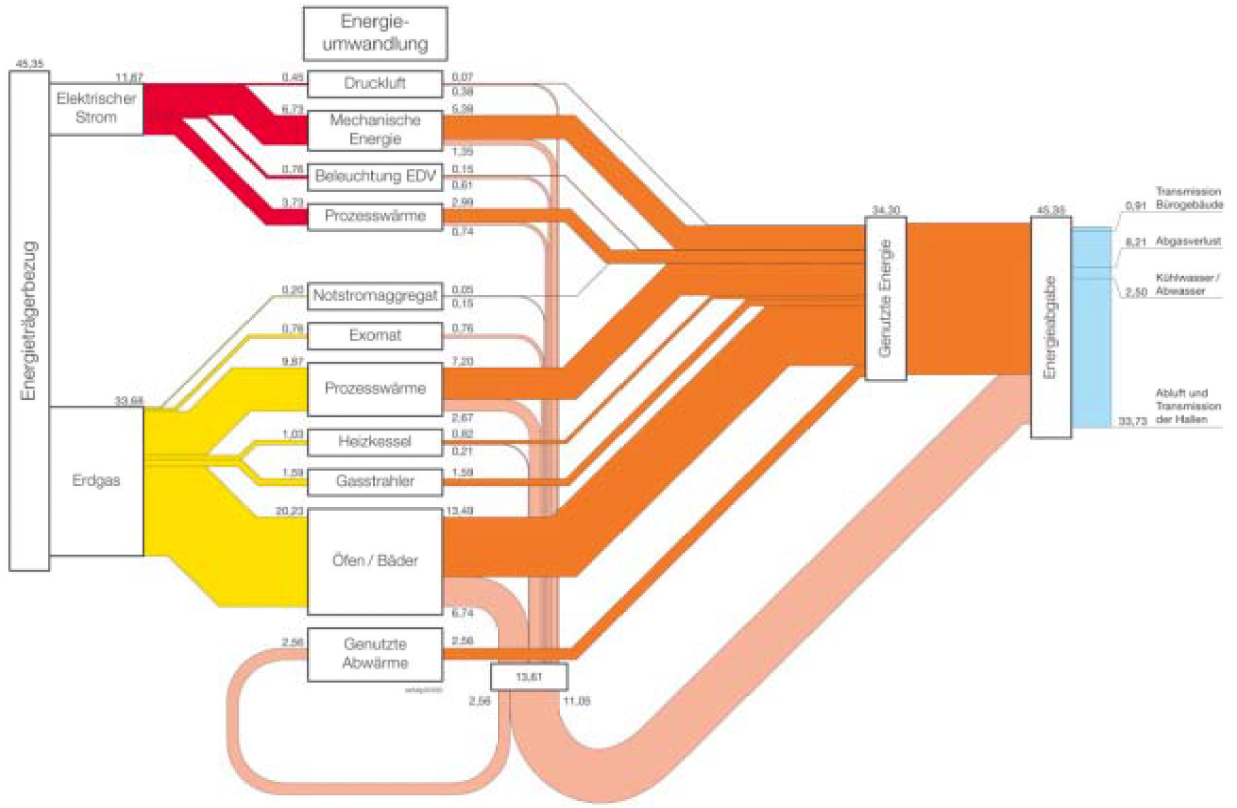
Below is a Sankey diagram example for Austrian company ‘Joh. Pengg AG’ from a 2005 report published by Austrian Federal Ministry for Traffic, Innvation and Technology (bmvt): (H. Bayer: ‘Abwärmenutzung und Einsatz Erneuerbarer Energieträger in einem metallverarbeitenden Betrieb’, Report in German, Sankey diagram on p. 34).

All flows in kWh, total energy consumption for the year 2003 is 45,35 Mio. kWh. The red flows are for electric energy, the yellow ones for energy from natural gas. The middle column has the different equipments that consume energy within the company. Useful energy quantities (“Genutzte Energie”) are shown in orange, while losses are outputs in pink that are visually “collected” and joined again in the last node. Not sure what the light blue part stands for.

Sankey diagrams @ visualign

The blog post I mentioned yesterday also has two fine examples of Sankey diagrams done with Mathematica. Nice colorful ones. Black background.

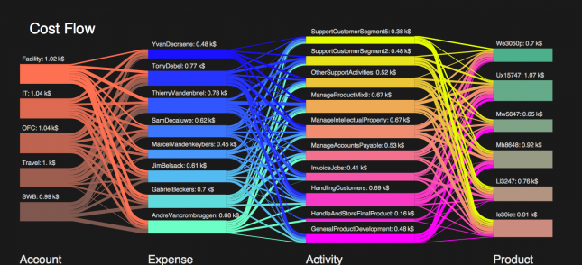
The first one is on cost flows and their distribution onto accounts, expenses, activities, and products (each represented by a column with nodes).

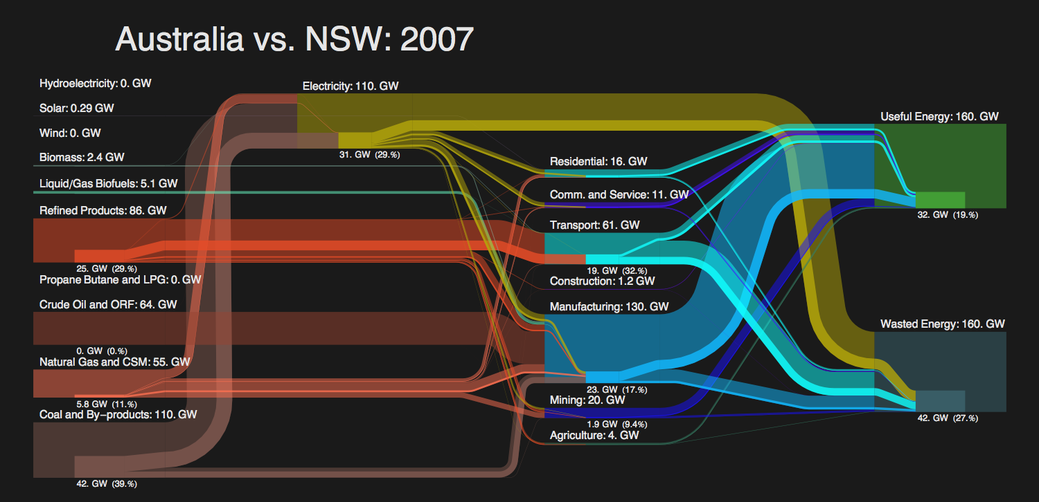
The other is by Sam Calisch (the author of the Mathematica workbook) and visualizes the efficiency of energy use in Australia.

Actually this second diagram is made up of two Sankey diagrams: the main one for Australia, the overlay one with the values for New South Wales. A cool idea to show the share of NSW.

The author of the post at visualign says that he “wouldn’t be surprised to see Sankey Diagrams make their way into modern data visualization tools such as Tableau or QlikView, perhaps even into Excel some day…”. This is of course an idea I like…

The math behind those curves…

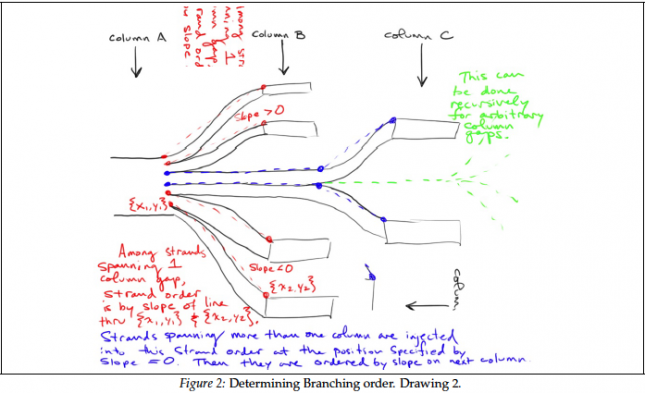
A great post on Sankey diagrams at the visualign blog led me to Sam Calisch’s PDF at github. It contains some insight on the maths behind the drawing of Sankey diagram curves, especially the type known as spaghetti diagram or distribution Sankey diagram (see discussion here).

There are some great scribbles in this paper that I wanted to share.

And I especially like this one, with the little man using the Sankey arrow as a slide…

The article is well-worth reading, so if you are into programming a Sankey software (the Mathematica workbook for Sankey might be a starting point), please download and study it.

Forced air and IR heating

The below two Sankey diagrams can be found in the following open access article: A. Kavga, G. Alexopoulos, V. Bontozoglou, S. Pantelakis, and Th. Panidis, “Experimental Investigation of the Energy Needs for a Conventionally and an Infrared-Heated Greenhouse,” Advances in Mechanical Engineering, vol. 2012, Article ID 789515, 16 pages, 2012. doi:10.1155/2012/789515

Conventional forced air heating of a greenhouse

Infrared (IR) heating of a greenhouse

.

The arrows have a fancy 3D effect. No quanitative reference is given, but the article mentions that “the diagrams are qualitatively representative of the energy flow of systems utilizing burners”.

Global Oil Flows

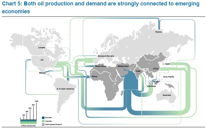
I am back after a few weeks of holiday. To get into posting again, here is a quick one I found at Graphic Design Forum in a discussion thread on software for creating trade flows (in this case oil flows) on a world map.

Flows in million tonnes (per year?). Scale element at the bottom left. No visible arrow direction, but instead a blue to green gradient on each band (blue for export, green for import). Middle East region being the largest exporter remains a problem with a very wide Sankey arrow leaving through the Indian Ocean.

Consumer Spending Breakdown Sankey

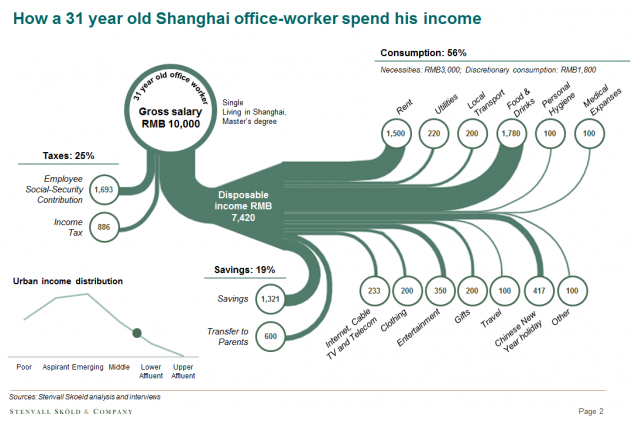
Carl-Johan Skoeld of China-based strategic advisory firm Stenvall Skoeld & Company presented the following Sankey diagram in his recent post on ‘How a 31-year old Shanghai office worker spends his money’.


(Stenvall Skoeld & Company via ChartPorn)

This is a fine sample of a Sankey diagram that merits some more explanation:
In fact, these are two combined Sankey diagrams. The overall sum of 10,000 RMB income breaks down to some 25% taxes, 19% savings and 56% spendings (consumption). The Sankey arrow representing the disposable income is then zoomed to allow for more detail to be seen. Hence the Sankey arrows in the left part of the diagram are not the same scale as the ones on the right. The arrows branching out to the top are considered “necessities”, while the one that go downwards represent “discretionary spendings”. Circles at the end of the arrow show the amount in Chinese currency. As the author points out, “this example is from one of the respondents and not an average of all respondents.”

Transfer Price for Soccer Player

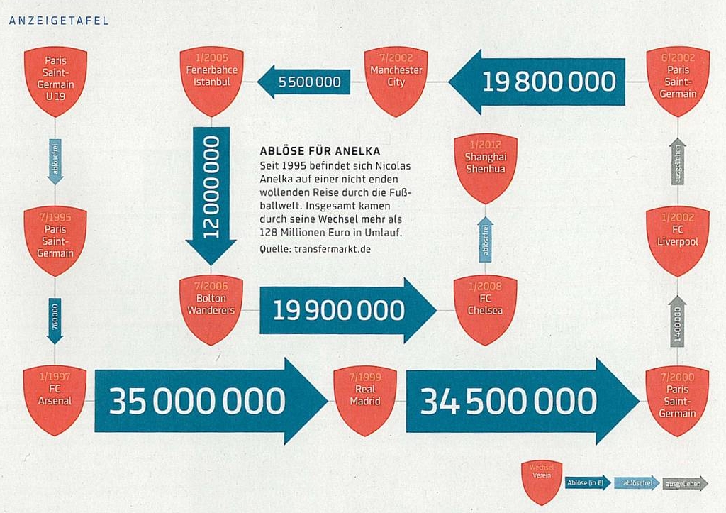
Blog reader W. Rufer sent a scan of a Sankey diagram from his favourite soccer magazine.

Rufer writes: “I found this rather unusual Sankey diagram in a German soccer magazine called 11Freunde (11Friends). It visualizes the career of French international Nicolas Anelka in terms of transfer and lending fees. He started in the youth team of Paris Saint-Germain, changed to their first team in 1995 and got sold to Arsenal for 750’000 € (left side of the Sankey diagram). From there he made his way through Europe, sometimes for incredible transfer fees of about 35 million €. Now, as a rather old player, he earns his money in China.”

The legend also has grey arrows, when Anelka was “on loan” to another club. The change to his current club was without tranfer fee (different blue).