US Energy Flows in 2010

Check out NETL January 2012 newsletter. It features a Sankey diagram with the 2010 data on U.S. Energy Flows. Publication details are here.


Download high res version of the Sankey diagram (large PDF) here.

This was prepared by Eric Shuster and is an update to the Sankey diagrams published annually by LLNL. It has the energy carriers on the left, energy conversion in the middle, and energy use sectors on the right. Primary energy consumption in the U.S. in 2010 is estimated to have amounted to 98 quads (quadrillion BTUs).

“NETL energy analysts have produced for the public a set of Sankey diagrams based on data obtained from the Annual Energy Review 2010 recently released by the U.S. Energy Information Administration. Graphically representing both quantity and direction, the diagrams place in perspective the relative contributions of major domestic energy sources as well as the flow of fossil fuels around the world.

The “Estimated U.S. Energy Use in 2010″ flow diagram shows the quantity of fuels used to drive each of the sectors in the United States. Overall, 83 percent of the primary energy consumed in the U.S. is from fossil fuels and downstream, due to conversion efficiencies, 89 percent of the total energy delivered to the end-used sectors is derived from fossil fuels.”

The news item also has a link to another presentation ny NETL featuring global coal and gas related flows as Sankey diagrams. These are interesting as will and I will present them here in the near future. Update: Coal is here, natural gas still to come.
Emissions Sankey of an Austrian Brewery

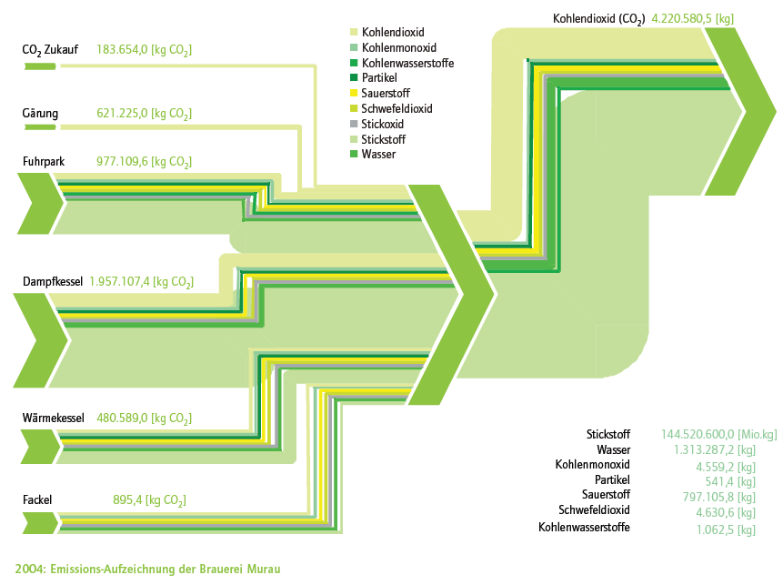
A company brochure commemorating ’10 Years of Environmental Management’ at Murau Breweryin Austria features this sparkling green Sankey diagram:

The diagram visualizes gaseous emissions (carbon monoxide, carbon dioxide, oxygen, nitrogen, …) from different equipments (e.g. steam boiler, fermentation tank, flare, …) in 2004. Carbon dioxide emissions are given in absolute values as flow label. All flows in kilograms (Note: nitrogen quantity (‘Stickstoff’) probably erronously labeled ‘Mio kg’ in the legend).

Good job … Prost!

Exergy and Enthalpy Sankey Diagrams

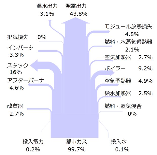
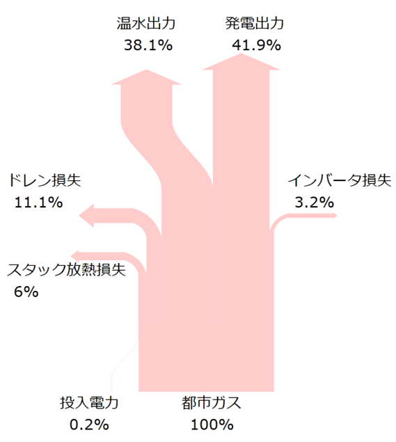
Found the two Sankey diagrams on the website of the Exergy Design Joint Research Lab of Osaka University in Japan. The diagrams are for enthalpy and exergy in a Solid Oxide Fuel Cell (SOFC). Can’t fully understand what it means, but both are simple breakout Sankey diagrams that could also be presented as a pie chart.

The first one is titled “Enthalpy Sankey Diagram”:

The second one is a “Exergy Sankey Diagram”:

Anybody care to explain more?
Looking at the choice of color one could be led to believe that enthalpy is female, while exergy is male.

Energy Balance for Urumqi, China

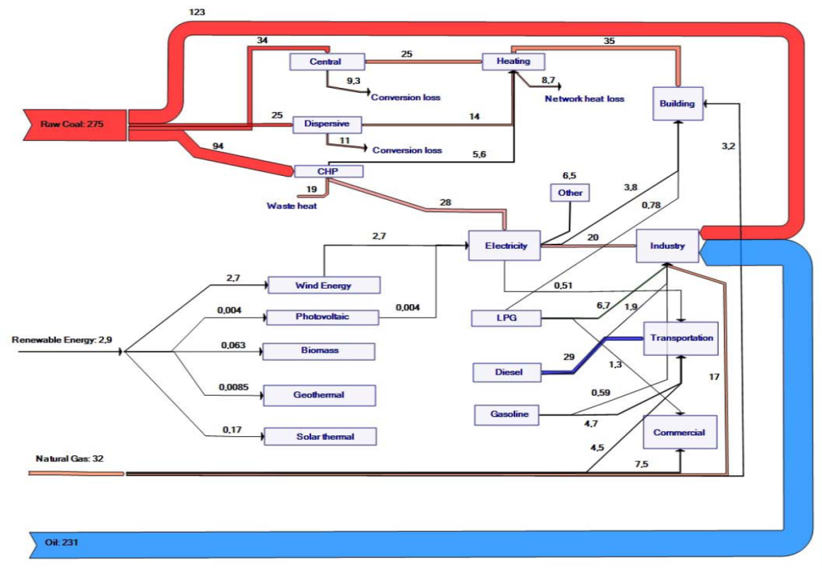
Below is a Sankey diagram representing the energy balance for the city of Urumqi in Northwestern China. This was elaborated in a Sino-German Project on ‘Meeting the Resource Efficiency Challenge in a Climate Sensitive Dryland Megacity Environment: Urumqi as a Model City for Central Asia’ and has been published in the Integrated Heating and Building Energy Efficiency Master Plan for Urumqi in 2010

The Sankey diagram doesn’t sport the energy unit, but the text comment says:

The 2007 energy balance of Urumqi shows that about 541 PJ of primary energy was consumed in the city, accounting for 28% of the Xinjiang total (1,927 PJ). Urumqi used 25% of Xinjiang’s coal, 50% of its oil, 12% of its natural gas, and 4% of its renewable energy, much of it in heavy industry. This results in high energy related per-capita CO2 emissions of 22 tonnes. In 2007, the city consumed 14.7 million tonnes of coal (approximately 51% of its primary energy supply) whereby 30% of the coal consumption was used for the heating of buildings.

Interactive US Energy Sankey

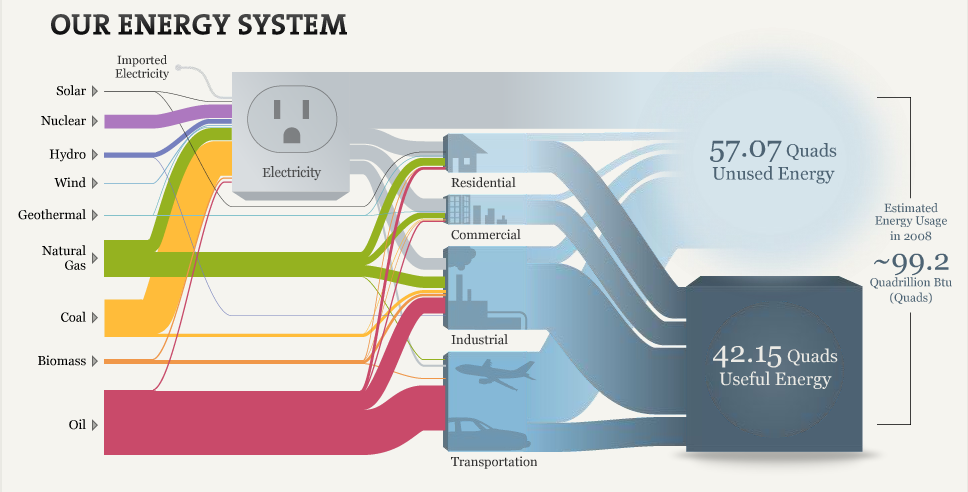
Another interactive Sankey diagram for U.S. Energy Flows (similar to the one by Bloomberg’s David Yanofsky) also based on the LLNL Energy Sankey Diagram can be found on a web page of The National Academy of Sciences. Visitors can explore the energy mix and consumption.

Click here to visit web page and start exploring…

Flows are in quadrillion BTUs or ‘quads’. The footnote reads:

Hydro, wind, and solar electricity inputs are expressed using fossil-fuel plants’ heat rate to more easily account for differences between the conversion efficiency of renewables and the fuel utilization for combustion- and nuclear-driven systems. This enables hydro, wind, and solar to be counted on a similar basis as coal, natural gas, and oil. For this reason, the sum of the inputs for electricity differs slightly from the displayed total electricity output. Distributed electricity represents only retail electricity sales and does not include self-generation. The efficiency of electricity production is calculated as the total retail electricity delivered divided by the primary energy input into electricity generation. End use efficiency is estimated as 80% for residential, commercial, and industrial sectors, and as 25% for the transportation sector.

Nice graphics and a good idea to convey “What You Need To Know About Energy”.

Cogeneration Visualized – Part 2

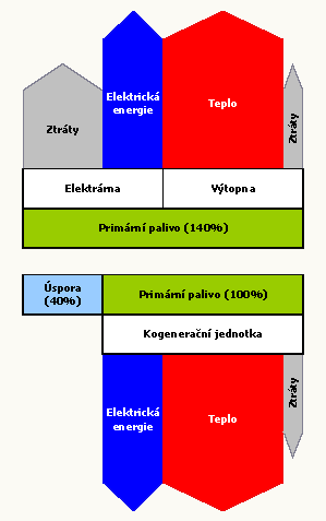
Following up to my recent post on cogeneration Sankey diagrams from Czech websites, here are a few more.

First, a rather simple one which has some fancy arrow heads, partly overlapping other arrows. This one is from the CEZ Energo website and just a schematic visualization of the cogeneration principle.

The next one has a strictly vertical orientation and is built from rectangles and simple block arrows. It uses the same values as in the diagram I shows in the last post. Found on the Plzenska Energetika website.

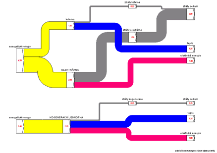
The last one can be found on the TZB Info engineering website. Actually there are two separate Sankey diagrams being compared. A left-to-right orientation, the flow quantities labels sit on the node. This is the only one drawn with a Sankey diagram software (judging from the node symbols I would say it is most likely the discontinued Sankey 3.1 by Fichtner)

.

If you find other cogeneration Sankey diagrams pls drop me a line…

President’s Budget Revenue/Spendings

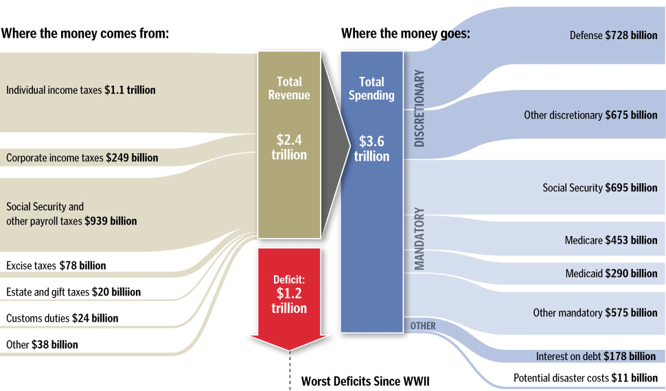
In a post on the winners of the SND 31 competition over at the Infographics News Blog I found the below diagram on the President’s Budget. Originally published by the Washington Post it has won an Award of Excellence in the 31st edition of the Society of News Design contest in the Infographics / Breaking News section.

It is not really a Sankey diagram, since the arrows are not explicitly directed. But it has weighted arrows/bands, in this case representing $$$. This infographic was maybe inspired by this one from Spain that was – after lengthy discussion – named a “distribution diagram”.

I cropped the lower part of the infographic that had details on the deficit as bar chart. See original, full infographic file here.

Two more infographics in this post have characteristics of Sankey diagrams, and I might post them here on the Sankey Diagrams blog, if I run out of ideas one day…