How Circular is the Global Economy?

I had previously reported on Sankey diagrams being used in articles on circular economy (earlier this year in January and back in 2013). Researchers in the field of MFA, circular economy and urban mining apparently love to use them…

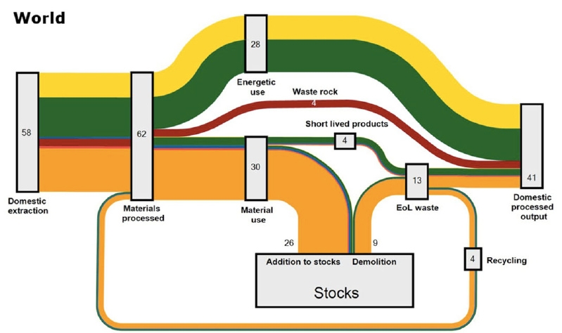
Here is another one from an article by Willi Haas et.al. published a few weeks ago (How Circular is the Global Economy?: An Assessment of Material Flows, Waste Production, and Recycling in the European Union and the World in 2005; DOI: 10.1111/jiec.12244).


Open Access @ Journal of Industrial Ecology, via Green Manufacturing blog

The answer to the question raised in the title is answered visually: Not very circular!

The above Sankey diagram is for “all societal material flows globally”, world mass flows moved by mankind. 62 gigatonnes (Gt) of material processed, out of which 58 Gt are newly extracted, and only 4 Gt recycled. “From such a system-wide metabolic perspective, the degree of circularity of the global economy measured as the share of actually recycled materials in total processed materials appears to be very low, at 6%.”

Fossil fuels (yellow) are converted to energy, most biomass (green) ends up as gaseous emissions or solid waste. Construction materials are in orange and metals in blue and these add to stocks of buildings, infrastructures, and other goods with a lifetime longer than a year. The two red arrows are for industrial minerals and “waste rock” (would that be tailings from mining?). Note: The legend is cut off in the screengrab above (please check the original article, page 6).

Interesting article, make sure you read it (open access). It also features a second similar Sankey diagram for Europe (EU-27). Beautiful and intelligent use of a Sankey diagram.
FIFA financial accounts Sankeyfied

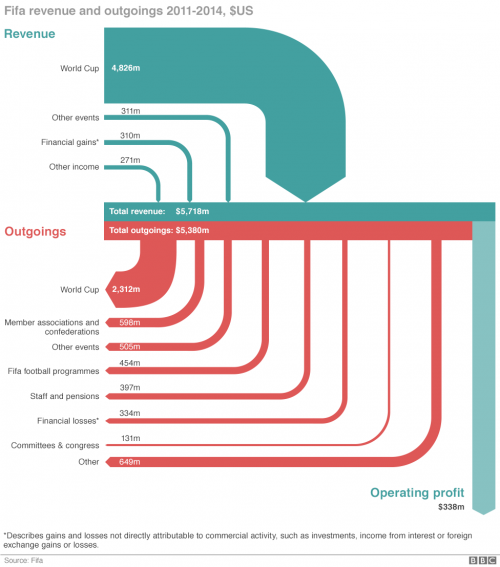
This diagram is by Salim Qurashi and Gerry Fletcher for the May 29, 2015 BBC News article ‘How Fifa makes and spends its money’ by Paul Sargeant.

BBC News via Coffee Spoons blog

The data is based on FIFA financial statements for 2011 through 2014. Flows in US$. The diagram depicts how “the Zurich-based multi-million-[dollar] organisation make its money and what does it spend it on?”.

This is only “sort of a Sankey diagram” as Brendan Barry “the man behind Coffee Spoons” notes. The light blue arrow for “operating profits” represents the balance difference between turquoise incoming and red outgoing flows. The infographic authors chose to set the arrows apart, which make it difficult to verify if arrow widths are to scale.

For the expert eye, some observations:

(1) Why has the sort order for incoming and outgoing flows been reversed? Imagine the red outgoing flow for “World Cup” (2,312m) being located at the right side thus becoming the longest arrow with a stronger emphasis…

(2) Not all flows are to scale: Compare the width of the light blue arrow for “operating profits” (338m) with another flow in the 300m-range such as “Financial Losses” (331m). An unintended flaw?

Compressed Air System

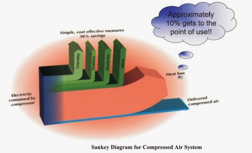
This 3D Sankey diagram for a compressed air system from a Mechanical Engineering blog post is taking it somewhat over the top…

It shows energy efficiency of a compressor. Only a fraction of the energy (electricity) to power the compressor is converted and delivered in compressed air, while the largest chunk is wasted as off-heat.

Yes, the 3D-look is fancy (see other samples of the 3D species here). The elliptic orange backdrop makes it look more dramatic, but doesn’t really contribute to conveying the information. No units are given.

The green arrows represent “simple, cost-effective measures” that could probably increase efficiency of the compressed air system if implemented. The blue arrow that stands for the energy delivered as compressed air is supposedly “approximately 10%” of the energy input, but he height is much less than 1/10th of the stacked arrows.

Poland Trade Balance

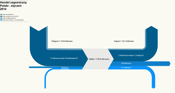
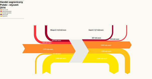
The ‘Blog Audytorów Sledczych’ had two interesting Sankey-style diagrams.

The first is the trade balance of Poland for the month January 2014. Flows are in Euro (trade volume). There is a trade surplus of 176,4 million Euros. Unfortunately only the legend shows what the arrow colors mean, but it is not legible in this screenshot.

The second one focuses on the five main trade partners of Poland. Here the value of imported goods is higher (8,7 billion Euro) than the value of exported goods (8,5 billion Euro).

Again the legend is somewhat difficult to decipher, but we can see Germany, Czech Republic, UK and Russia. Largest trade partner (both regaring import and export) is Germany (large orange arrows).

Trade imbalance is visually barely noticeable, just by a slight step when looking at the incoming and outgoing arrows.

Amsterdam Energy System Visualized

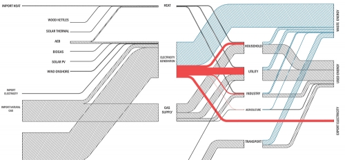
Tom Van Heeswijk and Changsoon Choi, landscape architecture master students at Wageningen University in the Netherlands have created the below “preliminary Sankey diagram of the Amsterdam energy system”. This is part of the larger project URBAN PULSE described on the research page of the NRG lab website.

Only the top part of a larger Sankey diagram is seen here, the bottom part with fossil fuels apparently cropped. No units or figures shown, so just a schematic visualization.

Nevertheless some interesting features: in contrast to many other Sankey diagrams, nodes are not depicted with outlines but shown as gaps with their name. Electricity is highlighted as red bands while all other flows have a single-hatching fill pattern.

Beauty of simplicity…