Category: Samples

United States Annual Energy Review 2008

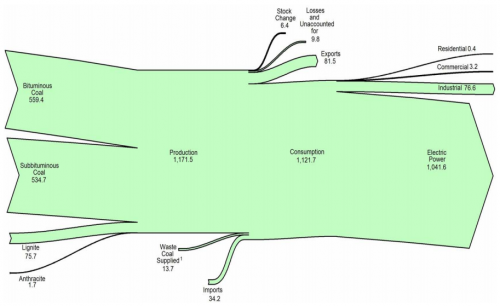
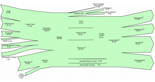
U.S. Energy Information Admmoinstration (EIA) now has the 2008 Annual Energy Review (AER) on their website. It contains Sankey diagrams for the nation’s overall energy flows (almost a “classic”) and four additional separate Sankey diagrams for petroleum, natural gas, coal and electricity.

This is the U.S. Energy Flow diagram for 2008:

Check the original PDF file with the accompanying footnotes for further details. Overall energy consumption in 2008 was 99 Quadrillion BTUs (preliminary value, slightly down from the 101 Quadrillion BTUs in 2007.

Among the other diagrams in the report, I chose to show the one for coal. 1121 mio. short tons have been consumed in the U.S. in 2008, mainly (1041 mio short tons) for electric power generation. The U.S. is a net coal exporter.

The diagram has a weird sinking downward feeling, caused by the fact that the main left-to-right orientation axis is not maintained. Looking at this it makes me want to shout out: “Hey coal Sankey, cheer up, life isn’t that black…!” 😉

The original full AER report (7.5 MB) can be found here.
VisioGuy invents Radial Sankey Diagrams

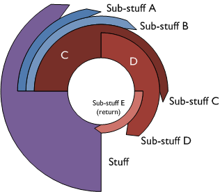
Chris the VisioGuy recently came up with Radial Sankey Diagrams. Although he didn’t seem to be sure if there is a “need for radially-oriented Sankey diagrams”, the commentators of his post immediately came up with ideas: use for rotating or radiating processes, cigarette rolling, recursive industrial processes, reinvestments, and so on… even stellar nuclear reactions were mentioned.

This is the ‘Everything Radial’ Circular Sankey Diagram

… and this is the ‘Tangential Fly-off’ Circular Sankey Diagram

One concern seems to be that the proportional arrow magnitude doesn’t work that well, since the human eye perceives the arrow area rather than thickness in such a circular Sankey diagram.

Thanks VisisoGuy for this contribution to the big basket of Sankey diagrams

Thermax shows benefit w/ Sankey diagram

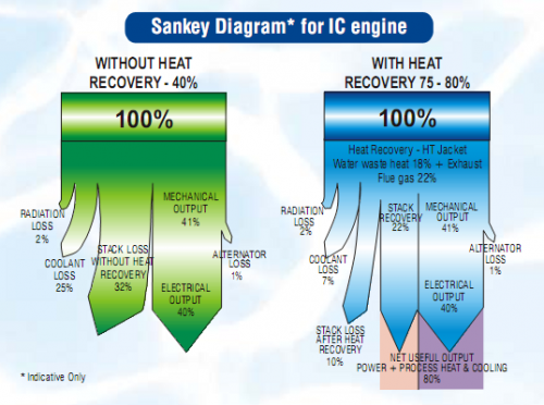
The PDF product brochure of Thermax Multi Energy Vapor Absorption Machines (Source: Thermax India Ltd, Pune) features a Sankey diagram comparing a conventional system (green) with a system that has heat recovery (blue).

The Sankey diagrams are labeled as “indicative only”. Fair enough, since the small flows (e.g. “radiator loss” and “alternator loss”) are not to scale. In fact this over-emphasis of the smaller flows seems to lead to an underrepresentation of the actual benefit of the Thermax system: The 80% “net useful output” of the blue diagram is only shown with a width of roughly 50% [measured with a conventional ruler off my screen…]

Any other product brochures with Sankey diagrams you are aware of? I actually found this pictured in a scientific paper (DOC).

It is also a rare example of a top-down orientation in a Sankey diagram. Most of the ones you find are left-to-right or bottom-to-top oriented.…

Diesel Engine Sankey Diagram

Just back from a few days at the beach, here is just a quick one…

User BoH created a Sankey diagram for a diesel engine and uplodad it to the WikiCommons. It is in Dutch and shows the energy efficiency of the fuel being burnt in the motor.
Sankey diagram for Diesel engine (WikiCommons)
49.3% of the energy is useful energy transformed into motion, while the rest is lost. The main losses (30.45%) occur at the exhaust gases, and with cooling water (approx 10.5%).

The smaller arrows are not to scale (see the 0.76% arrow branching off on the left side compared to the one representing 1.5% (smeeroliekoeling, cooling of lubricant oil)). Also, I am not sure whether the author forgot an arrow at the blue node labeled “Lucht” (air).

Anyway, apart from these flaws it is a neat diagram. I particularly like the color gradient from ‘red hot’ to ‘cool green’.

New Zealand Energy Flows 2007

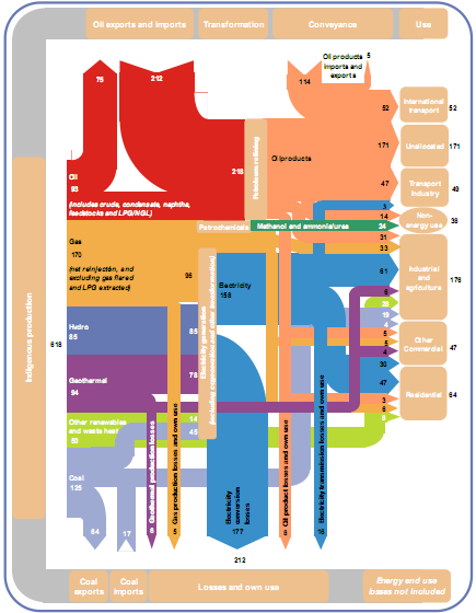
To compensate for the rather awkward Sankey diagram from NZ in my last post, here is a more colorful, and more recent one from Aotearoa. It shows the energy flows of New Zealand in 2007. The Ministry of Economy published a report “Energy in Brief”, which also contains this Sankey diagram:

The diagram shows the main ïŹ‚ows in gross PJ (1 petajoule = 1015 J) and is “to approximate scale”. Flows below 2.5 PJ are neglected.

Energy produced domestically from various sources comes from the left, imports of coal and oil enter in the leftmost column from the bottom and the top. The energy flows pass through transformation and conveyance phases, to be finally shown in the different use sectors. Losses in transformation and conveyance are visualized with downward arrows, while losses in the end use are not considered.

There are some design flaws, especially when you look at the arrow curves. Also the fact that flows are only “to approximate scale” is in my opinion not acceptable [an arrow representing a flow of 3 PJ has the same width as one for 6 PJ, and both are only half the width of the 30 PJ flow]. But the overall impression is much better than in the version 10 years before.

Click here for a larger version of the diagram (PDF).

Confusankey Diagram

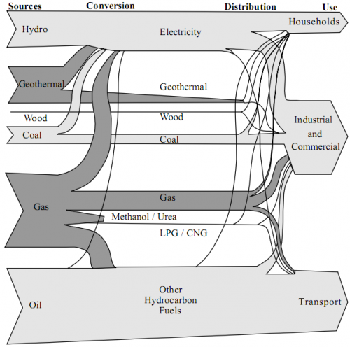
From the deepest and darkest parts of my bookmark list, here is a Sankey diagram for energy flows in New Zealand in 1997. I found it in a PDF document on this website of the Ministry of Economic Development (maori: ManatĂ» Ôhanga).

The text under the diagram reads: “This energy flow diagram summarises New Zealand’s energy use. Primary energy sources are at the left. The flow of these through conversion processes to consumers is pictured, with final end-use classified by consumer type. The width of the bands is approximately to scale.”

Well, almost everything that can go wrong in information visualization goes wrong in this diagram… No quantities or units are given. Flows that are “approximately to scale” narrow down along the way. [The only explanation I have for this, is that this a novel way to account for transmission losses.] Streams meet, but don’t seem to merge. No idea what the spaghetti flows are good for…
In defense of the authors of this diagram I can say that in 1997 there probably weren’t any Sankey diagram software tools around.

I have a nicer one for NZ, which I will present in of my next blog posts. Better energy flow Sankey diagrams from other countries can be seen here, here or here.

Water Flows in Electro Plating

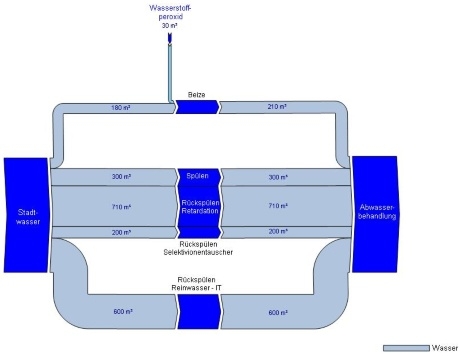
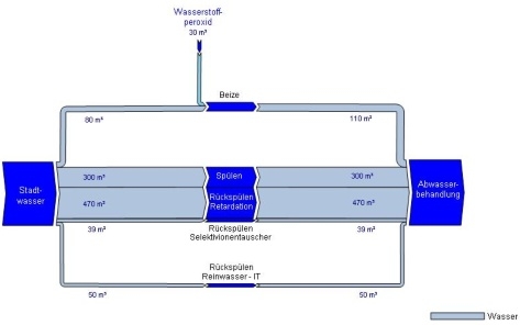
Austrian consulting company Stenum has revamped their Sankey Editor 2008 website a little bit, and they added new sample Sankey diagrams. The ones shown below are for the water flows of an electro-plating factory before and after optimization.

before:

after:

The diagram is in German, but I can understand as much as this: All flows are in cubic metres. Apart from the hydrogen peroxide flow entering from the top the flows shown all run from the source (water supply) to the sink (waste water treatment), the nodes in the middle (flushing, backflushing?) are the actual breakdown of the water flows. These nodes are adapted to the arrow width – a nice feature.

On top of that, blue seems the right choice for both water and H2O2 flows.