Category: Samples

B4E: Energy loss is synonym of ‘non-quality’

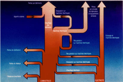
French La Courneuve based engineering consultancy B4E shows the following Sankey diagram on their energy diagnostics page.

Unfortunately the resolution is not good enough to determine any detail. I can understand as much as that they present fuels (“combustibles”) and electric energy (“electricité”) as the main energy sources. From these two sources the use of energy and losses (“pertes”) in a company is visualized in a bottom-to-top layout. No numbers are given, so this is just a schematic visualization.

As they say in the text: energy loss is synonym of ‘non-quality’

Hydrogen Generation Path Sankey Diagram

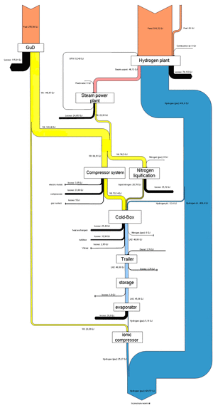
The below Sankey diagram is shown on a webpage of HAW University of Applied Sciences. It shows the generation path of hydrogen from natural gas, and the overall energy yield.

Unfortunately the diagram is too small to grasp the details. The Sankey arrows represent energy content. Losses are shown as black arrows. This seems to have been the result of a study project dealing with a fuel cell driven boat (ZEMSHIPS).

Sankey Diagram for Artifically Closed System

I really had doubts, whether I should present the following Sankey diagram I found on John Locke’s Gracefulspoon blog [aesthetic photos there, have a look!]. Finally decided to feature it, because I want to show the whole spectrum of application fields for Sankey diagrams, and I am trying to put my focus more on the graphical aspects of the diagram rather than the explicit content of the diagrams.

The Sankey diagram featured in this post is for “life support in an artifically closed system” or in other words, a prison cell. John explains:

“a sustainable prison cell unit for future Beijing. Because of their high population density, prisons are actually prime contenders for tests of renewable energy methods, such as waste to energy, and water recycling features. … each prisoner generates energy for their own confinement, but also send excess energy back to a central grid, acting like capacitors.”

The Sankey diagram has four interconnected “cycles”, each with their individual units: the energy flows (kWh), the water cycle (Litres), the waste cycle (kg), and food flows (lbs). The four subsystems thus must be interpreted relative to each other and not with their absoulute values. The main input that “feeds” the system is solar energy, the main output is recovered energy. Apart from a freshwater input flow and some comparatively small waste output flows (branching out vertically), the system seems fully closed. It is of course an idealistic assumption that prisoners can be fed solely on genetically modified micro-algae…

If you look at the Locke’s ‘Global Panopticon’ study project “conceived more as a sci-fi narrative”, let’s just hope that such ideas never turn reality.
Sankey Diagram for Regasifier Plant

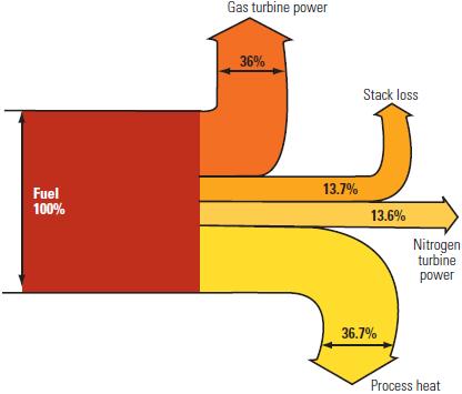
This post on the Power Industry News blog features a Sankey diagram “for a dual Brayton cycle regasifier plant [that] shows how the fuel is consumed”. The article describes possibilities of improving the energy efficiency of the liquefied natural gas (LNG) reevaporation process.

I quite liked the Sankey diagram for its simplicity, being to scale and color coding. The fact that the arrows for “process heat” and “stack loss” branch out in a slightly curvy way larger than 90° is uncommon, but hey, it gives the whole thing a special touch.

Gold Flows in United States

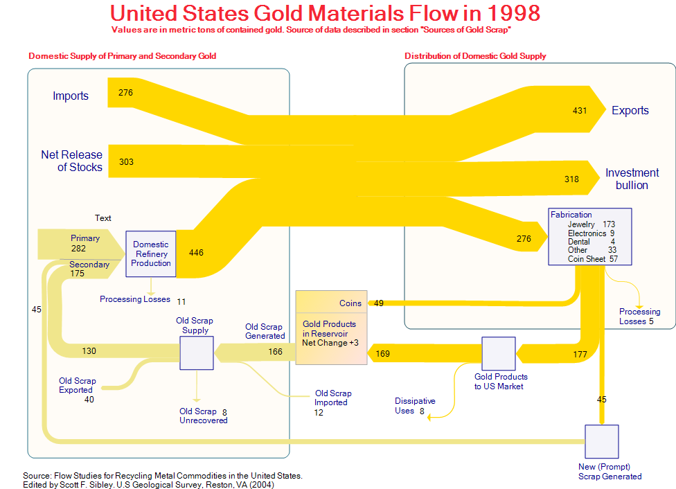
This Sankey diagram was posted as a sample on the e!Sankey Forum. It shows the gold flows in the United States in 1998. The original data is from ‘Flow Studies for Recycling Metal Commodities in the United States’ (edited by Scott F. Sibley. U.S Geological Survey, Reston, VA (2004)). Values are in metric tons of contained gold.

The left part of the diagram shows domestic supply of primary and secondary gold, as well as imports to the U.S., the right part distribution and use of gold. The U.S. is a net gold exporter. 318 metric tons gold bullion went to Fort Knox (presumably) that year. 276 metric tons were fabricated into products, mainly jewelry. At the same time 175 metric tons of new and old gold scrap were recycled. Along with the 282 metric tons out of primary production they are fed back into the production cycle.

The diagram has gold/light brown colored Sankey arrows that go along well with the topic. A text label has been forgotten in the left part.

Energy Loss Simulation for Students

Heading off for the week-end, but wanted to share a fun game for students I recently discovered on the website of Nelson Thornes, educational publisher from the U.K.

This Flash simulation teaches students “how we lose energy to the environment” and “what is the effect of maintaining a constant body temperature”.

Go ahead and try it: You have to choose whether you are a herbivore or a carnivore, whether you are cold-blooded or hot-blooded, and your activity level.
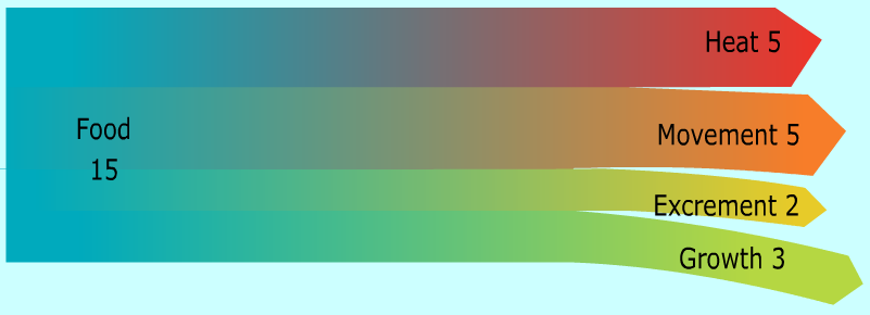
Here is the image that was created for me (couldn’t choose mixed diet though, so opted for meat).

When you’re done, just click on the button labeled “Sankey” and you will get a Sankey diagram that shows how the energy from your food is used for movement, growth, body off-heat and …. well, see for yourself!

A great idea, and a good idea to teach students about energy transformation and loss, and to get them acquainted to Sankey diagrams as alternative to pie charts.

(Images reproduced with permission of Nelson Thornes from http://www.nelsonthornes.com)

Updated Ireland Energy Sankey Diagrams

Colm from carbontracking.com in a comment to this blog post on Energy Flows in Ireland pointed me to an updated version of this Sankey diagram for 2007.

Sustainable Energy Ireland has published the report “Energy Ireland – Key Statistics 2008”.

This is the updated overall energy flow Sankey diagram from the report.

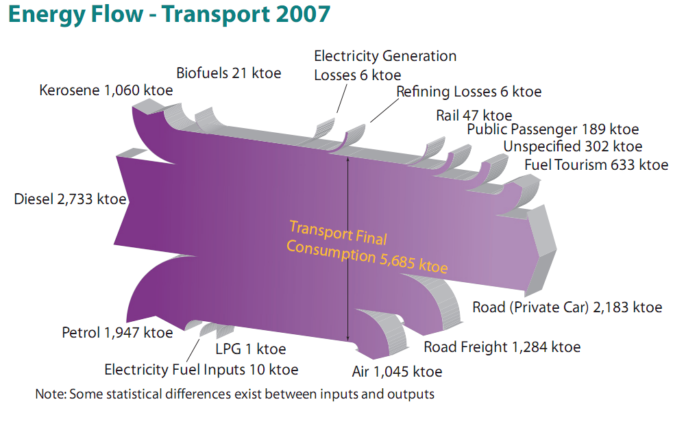
And here is another interesting one from the same report. It features the fuels used for transportation in Ireland with a breakdown by vehicle type.

All flows are in ktoe (1000 tonnes of oil equivalent, 1 ktoe = 41868 GJ). The flows seem to be mostly to scale, although there must be a problem with the flow ‘Refining Losses 6 ktoe’ which seems wider than the ‘Rail 47 ktoe’ flow, for example. Private cars consume most energy of all vehicle types (2184 out of 5685 ktoe or 38.4 %) , followed by trucks (road freight) and airplanes.

I won’t be commenting on the 3D design of the Sankey diagrams, which is definitely … eye-catching. Colm asked which software has been used to create these, but another reader had already pointed out in a comment that it is based on SankeyHelper, but has undergone retouching in Illustrator.

More Merry-Go-Sankey Diagrams

After writing about VisioGuy’s radial Sankey diagram idea, I went through my bookmarks and collection of Sankey diagrams in search of further candidates for this special class of circular flow graphs.

Here are two goodies… 😉

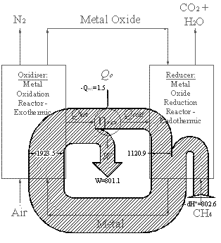
Below is a black/white Sankey diagram of energy fluxes in a chemical loop combustion cycle from an Imperial College website. It is similar to the radial one Chris designed, however it is not exactly circular. Not all of the entries and exits of the cycle are shown as Sankey arrows. The exit of the arrow labeled W is to the center (would one call this anticentrifugal?). The methane input makes a U-turn before entering the loop.

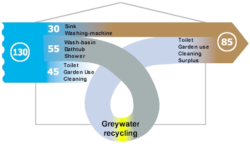
The other Sankey diagram is from this website of a U.K. based company, and shows greywater recycling. The average consumption of freshwater per person / per day in the UK was 130 litres in 1996.

The water from wash-basins, shower and bathtub could go through a recycling stage and be reused for flushing and watering the garden. The designer gave it a roller coaster style loop, which sure doesn’t add to the information content of the graphic, but immediately draws the reader’s attention to the recycling. I am not sure where the third flow coming from the right goes to. It represents the potential savings of 45 litres/day, but kind of disappears behind the loop.

I’ll post more of these as I come across them.