Losses Along the Energy Chain

As a followup to last week’s post on a Sankey diagram from the GEA report. here is another one from the very same report (GEA, 2012: Global Energy Assessment – Toward a Sustainable Future, Cambridge University Press, Cambridge UK and New York, NY, USA and the International Institute for Applied Systems Analysis, Laxenburg, Austria).

This one is an example for losses along the energy supply chain.
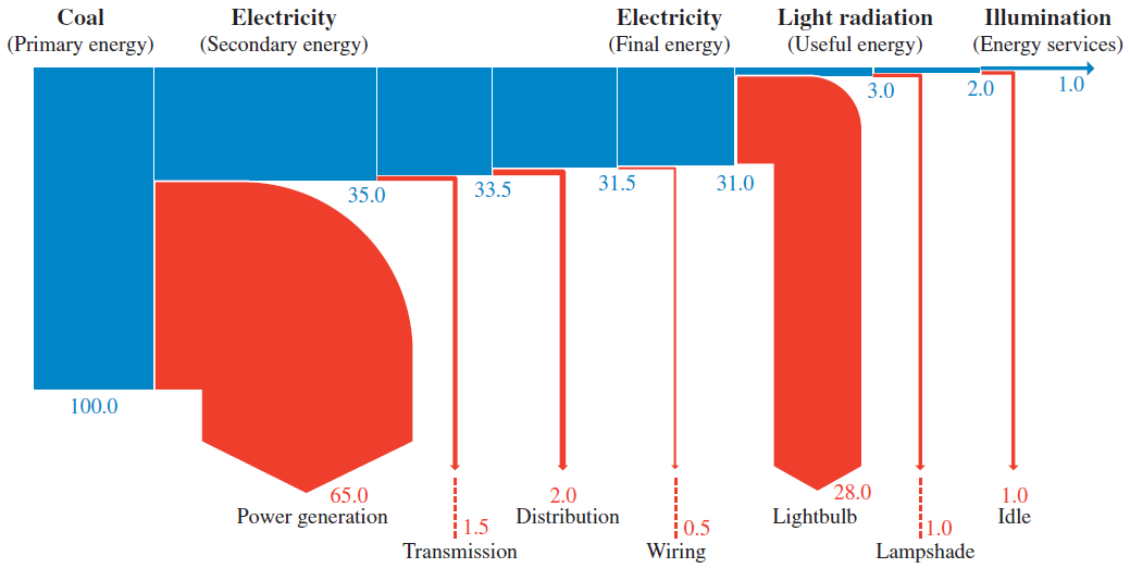
The description of the diagram on pp. 116/117 says:

“As an example of energy chain efficiency, Figure 1.13 illustrates the energy flows in the supply chain for illumination services (lighting). In this example, electricity is generated from coal in a thermal power station and transmitted and distributed to the point of end-use, where it is converted to light radiation by means of an incandescent light bulb. Only about 1% of the primary energy is transformed to illumination services provided to the end-user.”

The Sankey diagram shows the primary energy as 100% on the left and branches out the losses at each conversion/transmission step. The actual useful energy (the “energy service” of providing illumination) is only 1%. So in this example one unit of energy service requires 100 units of primary energy, clearly pointing to “abundant opportunities for improving efficiency exist at every link in the energy chain” (p. 116).

I have presented a similar Sankey diagram here before, see this 2007 post ‘What it takes to power a bulb’.
GEA Report: Global Energy Flow Sankey

Blog reader Johannes sent an e-mail, advising me that the 2012 GEA Report (GEA, 2012: Global Energy Assessment – Toward a Sustainable Future, Cambridge University Press, Cambridge UK and New York, NY, USA and the International Institute for Applied Systems Analysis, Laxenburg, Austria) has many Sankey diagrams worth checking out. Thanks! I downloaded this 1865 page (!) report (link, caution large 188 MB file!) from the IIASA website.

Here is one of the Sankey diagrams featured in the report.

This is a diagram for global energy flows in exajoule (1 EJ = 10E18 joules) “from primary to useful energy by primary resource input, energy carrier (fuels), and end-use sector applications in 2005”.

Similar national energy flow diagrams I have featured here typically are left-to-right oriented, but the structure is similar. Flow quantities are mostly shown as entry flows on the nodes (boxes). Losses displayed in yellow next to the grey exits at the bottom.

U-turn Sankey arrows

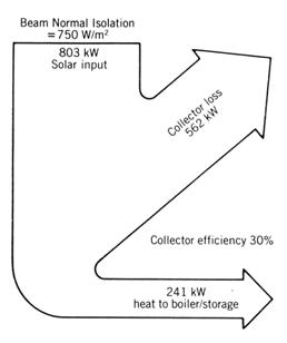
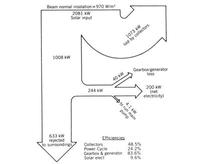
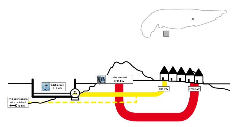
This legacy article on ‘Solar Energy System and Design’ by W.B. Stine and R.W. Harrigan (published in 1985 already) has four Sankey diagrams for energy flows in a solar power system.

The old-school black&white Sankey diagrams depicted have a general vertical orientation, and some flows branch out to the left of the general flow direction. This is OK, but the first branch flow bends with an angle larger than 90° degrees, performing an almost U-turn.

In the next diagram this idea is doomed to fail as the Sankey arrow to the left is wider than the one going straight on, and the initial parallel segment is much too short.

Additionally in this second Sankey diagram the two arrows at the bottom don’t add up with their flow quantities correctly (633 kW + 244 kW is not 1008 kW).

Show it with Sankey Diagrams

Phosporus in the natural environment and the food chain has been a topic of several posts on my blog. So it didn’t come as a surprise to find yet another diagram on phoshphorus flows over at Nels’s MFA Diagram blog (one of the blogs I follow closely, see blogroll).

MFA diagrams have their focus on the nodes and the build-up of stocks. Sometimes they get a touch of Sankey diagram with the arrows having different magnitudes. The MFA diagram below is for phosphorous flows in China 2008 (original source: Min Qiao, Yuan-Ming Zheng, Yong-Guan Zhu, 2011. Material flow analysis of phosphorus through food consumption in two megacities in northern China). Values are in tonnes.


(click image to enlarge)

We can detect arrows with three different brush widths (my guess is 1px, 2px and 4 px), each standing for a value range into which the actual flow quantity falls. This may, however, bes somewhat misleading when having a quick glance at the diagram.

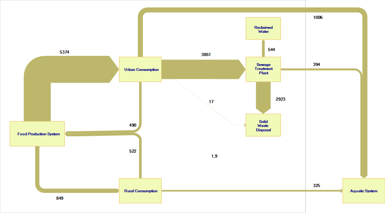
I quickly “translated” the above diagram to a Sankey diagram with flow values being actually to scale.


(click image to enlarge)

Here it is quite clear where the major phosphorus flows are located (from food production via urban consumption to sewage treatment plant and solid waste disposal: 2923 out of 5374 tons end up here). The other flows are comparatively small, with the phoshporous flow going directly to the aquatic system worth a mention. Two small flows in the center of the diagram are negligible, they are in fact so tiny in comparison to the major flows that they even don’t show up (or just as a hairline) here.

I have therefore added a minimum width of 1 px for small flows so that the annual 17 tons from urban consumption and the 1.9 tons from rural consumption to the solid waste disposal are at least visible (albeit not to scale with the other flows any more).


(click image to enlarge)

Final phosphorous sinks are solid waste disposal (landfill?) and the aquatic system.

Trigeneration Sankey

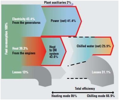
Via CarbonSignal blog comes the following post and Sankey diagram:

“Tri-generation, also known as combined cooling, heat and power (CCHP), is a combination of co-generation, known as combined heat and power (CHP) with an adsorption or absorption chiller to provide water chilling. More information of co-generation can be found here. The chilled water can then be used in refrigeration or air conditioning systems. The engine is connected to a generator which can supply electricity to the site or export electricity to the grid. Typically about 38% of the energy supplied as fuel to the engine is converted to electrical energy.

The rest of the energy leaves the engine as heat via the hot exhaust gases, the coolant system and the oil system. A large amount of the waste heat can be recovered through heat exchangers and can be used to supply all hot water to heat domestic hot water, supply heat to a HVAC system, or supply a chiller to provide all chilled water.

Alternatively the system can be designed to supply a mix of both hot and chilled water to match the site loads. The use of a heat recovery system and chiller can increase the efficiency to between 67- 85% depending on the mix of chilled and hot water required.”

Study on Computer Waste in Chile

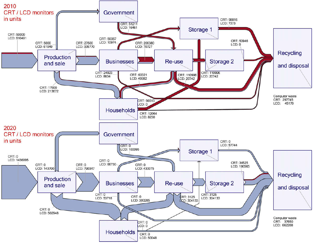
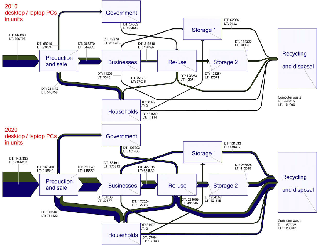
This post on the MFA diagram blog directed me towards a study on computer waste in Chile. The Sankey diagrams featured are for CRT/LCD displays and laptop/desktop computers,

These are the flows of CRT (red) and LCD (blue) in 2010 and expected units in 2020

and the desktop (green) and laptop computers (dark blue) flows in 2010 and expected for 2020 (no. of units).

The full scientific paper can be found here.
(via MFA Diagram blog)

Sankey Diagram in Energy Management

From a presentation on energy management held by Thomas Keller of Ecowin (available at the KNUT Hessen website) comes the following Sankey diagram.

The diagram is in German, but I get the main point: Energy and heat consumption in a company in MJ per hour. Fuels are natural gas (black streams) and electricity (red streams). The white boxes are the processes consuming the energy. Grey flows are transformed energy or losses.
Data seems to come from a energy management software with measuring devices installed along the production line. The company is about to obtain ISO 50001 certification.

I have recently noticed an increased use of Sankey diagrams in ISO 50001 case studies. Hope to see more of them coming.